
DaWanda
2015 – 2018 • Berlin
Redesigning
the search filters
INTRODUCTION
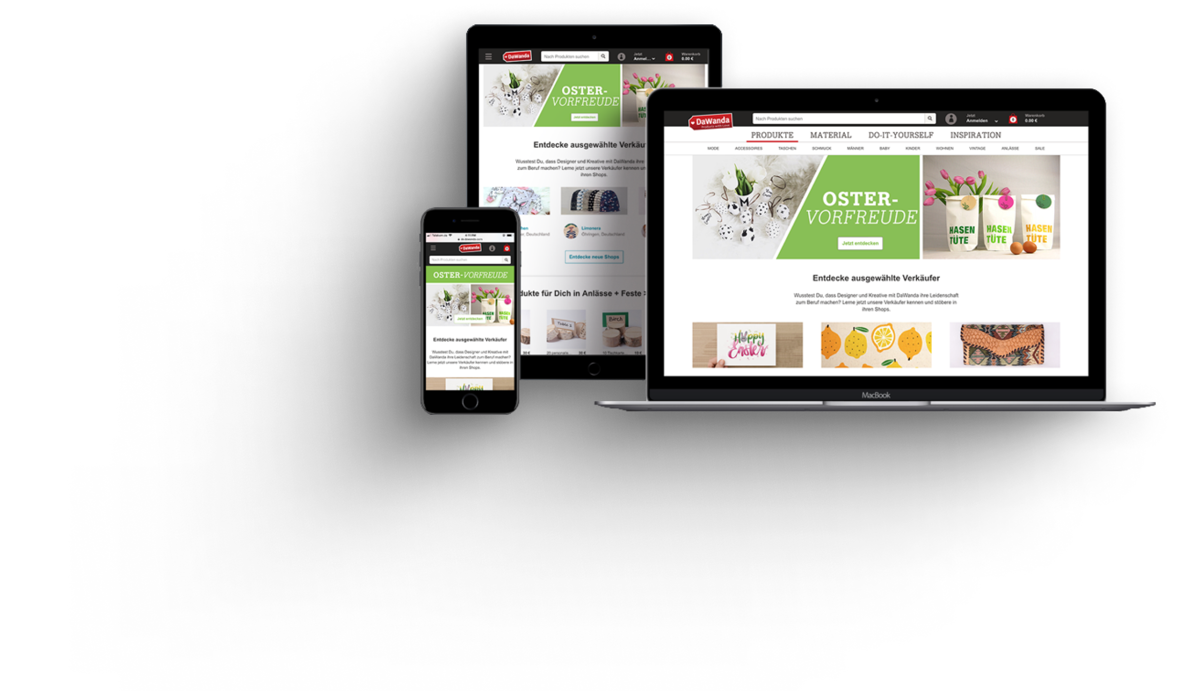
From 2015 to 2018, I worked as a UX Designer at DaWanda, Europe's largest marketplace for handmade products and DIY gifts before its acquisition by Etsy. In 2017, I became the lead designer for the Search and Discovery team, with a focus on enhancing the overall user experience for DaWanda's search and discovery process.
One of my key projects was the redesign of DaWanda's product filters. With millions of products and hundreds of categories, effective filtering was crucial to helping users find what they were looking for quickly and efficiently. However, DaWanda’s filters had several usability issues, which led to user frustration and higher-than-normal drop-off rates.
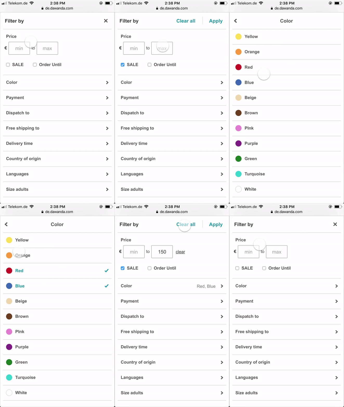
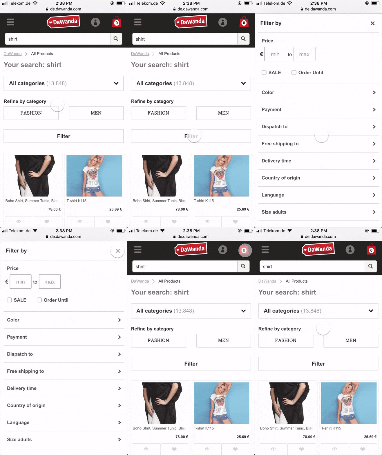
Here’s an overview of how DaWanda’s filters behaved:

THE PROBLEM
While some usability issues with DaWanda's filters were obvious an already well known, we needed a deeper understanding of how users interacted with them. Many of the filters were hidden behind dropdowns or within the "More Filters" modal, making them difficult for users to discover. Our goal was to determine whether users were even aware of these hidden filters and how effectively they were using them.
User Testing
To gather insights, we conducted a usability test focusing on DaWanda’s navigation and filters. Participants were asked to complete two tasks:

First task
Find a Christmas gift for a friend or family member. You can use any method you choose to find said gift.

Second Task
You need a leather case for your eye/sunglasses. How would you go about searching for this leather glasses case and adding it to your cart?
The aim was to observe the full user journey, from the homepage to adding a product to the cart, and to understand how they incorporated filters into their search process.
Participants: 6 participants (4 female, 2 male).
Equipment: MacBook Pro for screen and audio recording, along with a notebook for note-taking.
Sessions: Each session lasted 30 minutes and included pre-session and post-session questions to gather qualitative insights.
Key Metrics Collected
- Task completion rates
- Filter usage
- Time taken to complete tasks
Results Summary
The tests revealed several pain points:
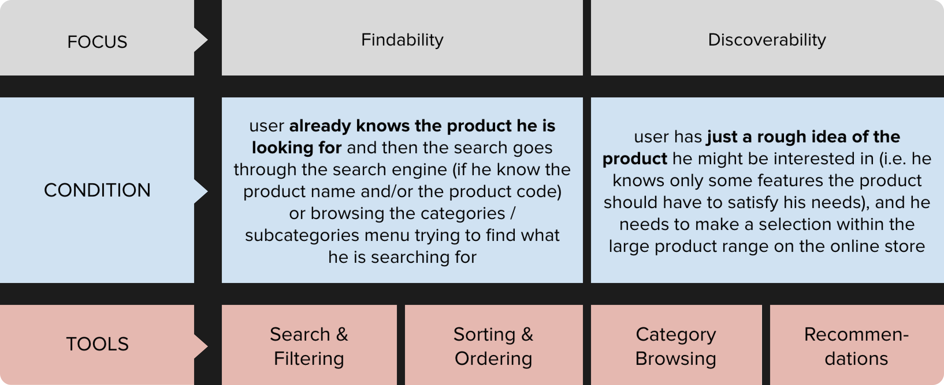
- Filter Visibility: Most participants did not notice the category-specific filters within the “More Filters” modal window. This led users to believe that certain filters didn’t exist.
- Search vs. Discovery: While users relied on the Gift Finder and categories for discovery, they turned to search when looking for specific items. However, using the search function often excluded important category-specific filters.
- Disappointment with Filtered Results: Users were frustrated with the filtered results, particularly when filtering by color, as the options often didn't match expectations.
- Overwhelming Categories: The sheer number of product categories added to the users' confusion, making the browsing experience feel overwhelming.
- Curated Products: Participants had a better experience discovering products by browsing DaWanda’s curated content pages, such as the Gift Finder.
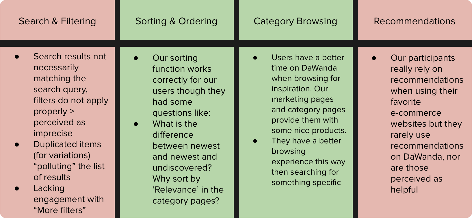
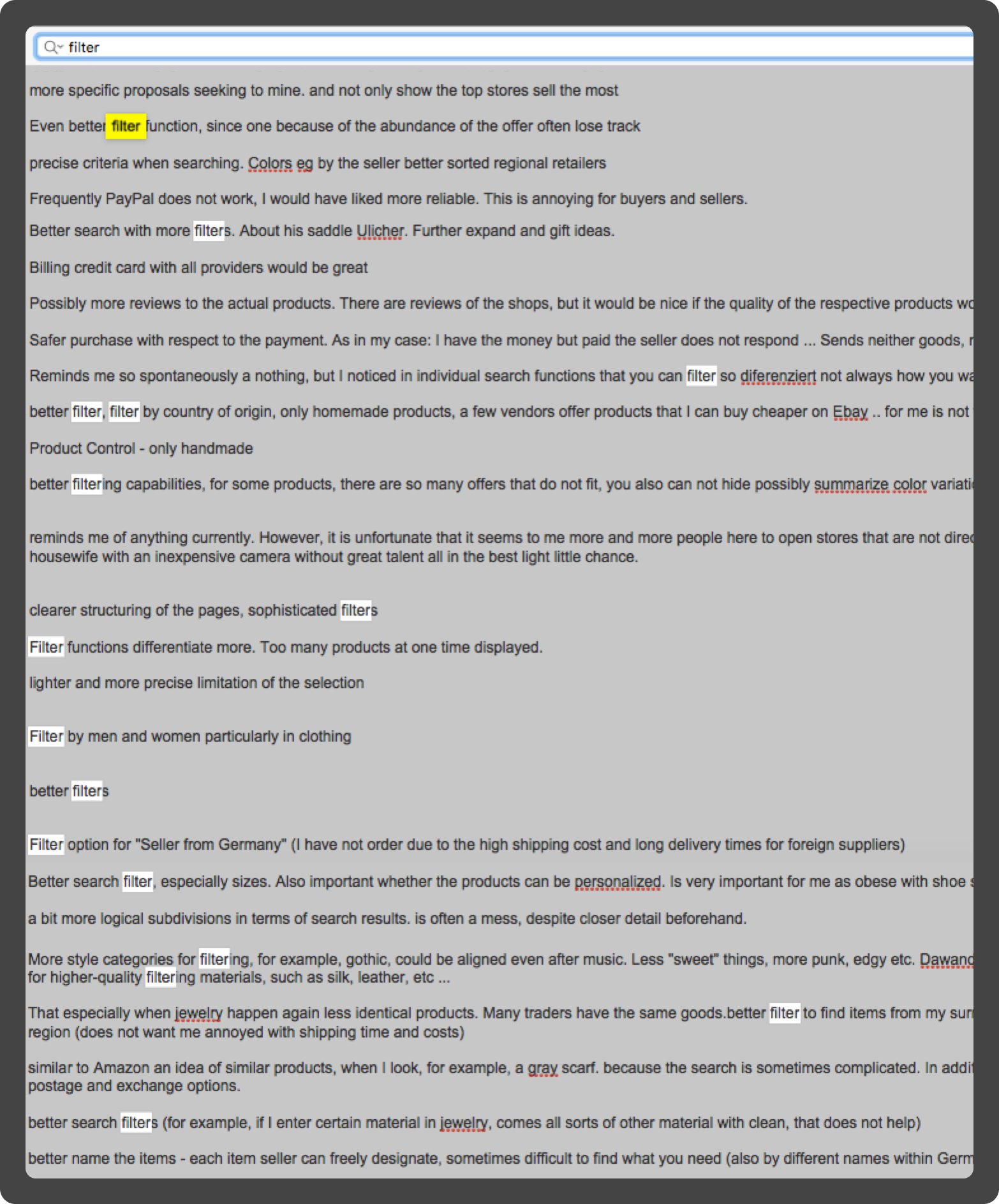
Analyzing past survey responses, it was clear that our filters were one of the biggest pain points for our users.
“Searching and going through umpteen pages (...) can be tedious and sometimes I don’t feel like continue searching because it is just too much. But then I think there may be the nice fabric that I look for on page 19, hence I don’t want to give up yet (...) and I bookmark the page to continue the next day (...) However, sometimes I feel simply overwhelmed.”
- DaWanda User
“There are way too many shops, way too many sellers. Hence, when you are searching for something - even with the price range narrowed down - you get so many good items (...) On the weekends, when I have plenty of time I can spend hours searching for items. But if you are quickly searching for something nice it can be a little overwhelming at times.”
- DaWanda User
The Biggest Problems
Through user testing we identified several critical issues with DaWanda’s filter system that were frustrating users and negatively impacting their ability to find products in an effieicnt way. These were the most significant problems:

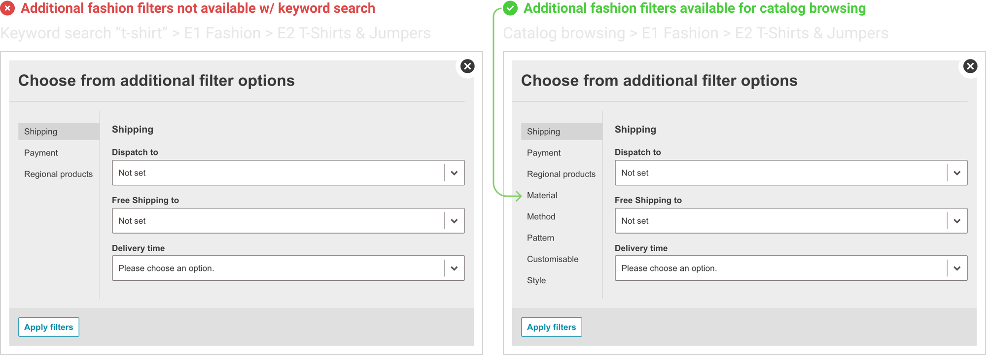
Lack of Category-Specific Filters in Search Results
When users searched for products using the search bar, they missed out on category-specific filters entirely. For example, if a user searched for "T-shirt," they wouldn’t see important filters like size, material, or pattern unless they manually navigated through the fashion category. This created confusion and frustration, as many users didn't even realize these filters existed when they were using search.
Example: Searching for "T-shirt" would not show filters like size and material, which are available when browsing the T-shirt category directly.

Filters Were Not Adaptive
DaWanda’s filters did not adjust dynamically based on the user’s selections. All filters were displayed at once, regardless of relevance to the selected products. This often led to users selecting filters with no matching products, causing them to land on a "No Results" page. This was frustrating, as users had no feedback or guidance to adjust their filters and try again.

Hidden Filters
Many important filters were hidden behind a "More Filters" button, making them less discoverable. Users were often unaware that additional filtering options existed beyond the visible ones. This "out of sight, out of mind" problem meant that users weren’t using the full range of filtering options, which could have helped them refine their search results more effectively.
OUR APPROACH
Minimize Learning
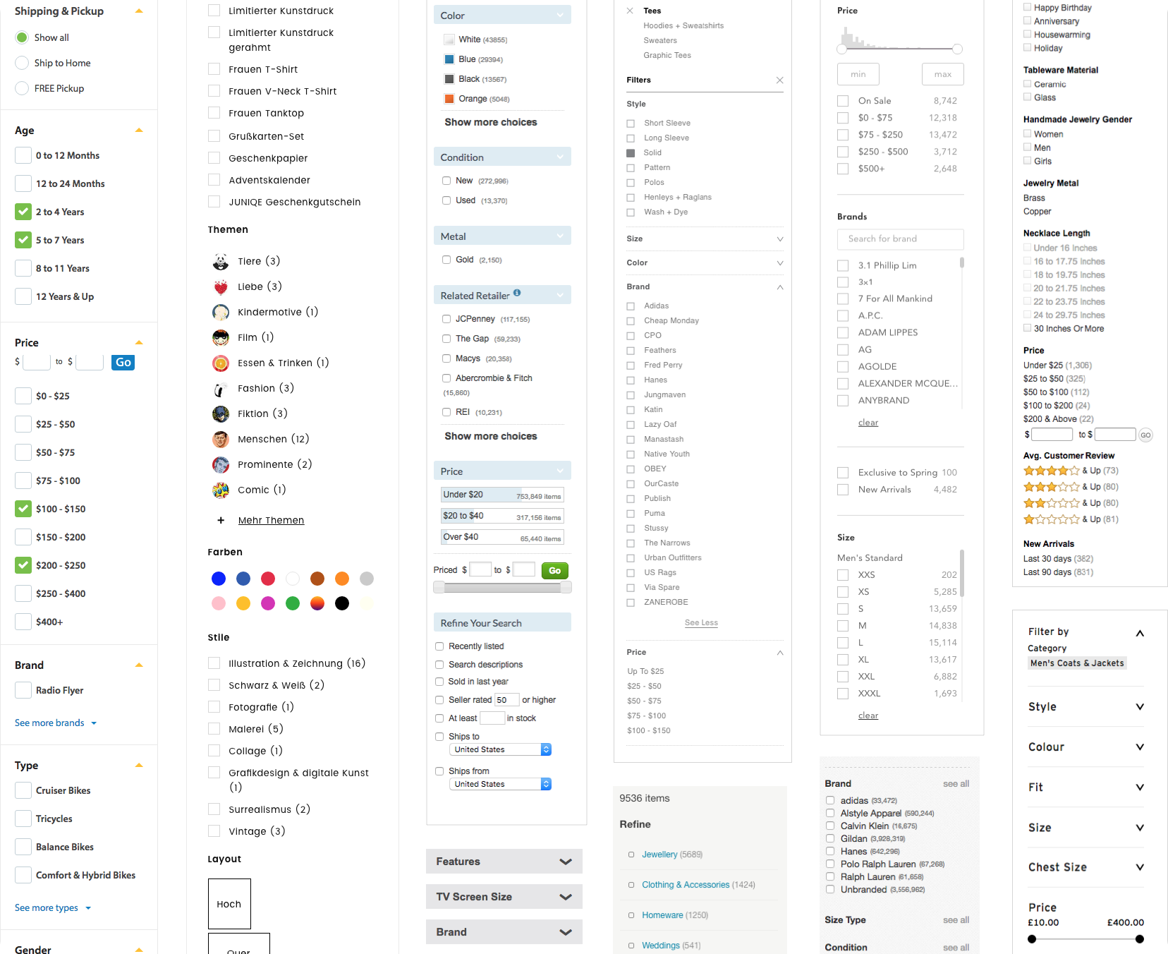
We began by conducting a competitive analysis of other major e-commerce platforms to understand current trends and best practices in product filtering. The goal was to identify common patterns in filter design and interaction models that users were already familiar with, which would help us minimize the learning curve for DaWanda’s users.
I analyzed filters on several e-commerce sites, focusing on how they performed at different breakpoints, how adaptive they were to user selections, and how they handled error prevention (e.g., avoiding "No Results" pages). The most relevant examples were collected into a mood board, serving as inspiration for our redesign.
Prioritizing Filters
To design filters that would be most useful to DaWanda’s users, I first needed a complete picture of the existing filter system. I created a detailed spreadsheet listing every filter option and component, which helped reveal the complexity of the system and the potential for simplification.
Next, I worked with the BI (Business Intelligence) and search engineering teams to gather data on filter usage. Unfortunately, the filters hadn’t been tracked thoroughly through Google Analytics, so I had to rely on query parameter data, which provided some insight. To supplement this, I turned to Hotjar, which allowed us to heatmap user interactions, view session recordings, and analyze conversion funnels. This provided a clearer picture of which filters users were interacting with most, and where improvements were needed.
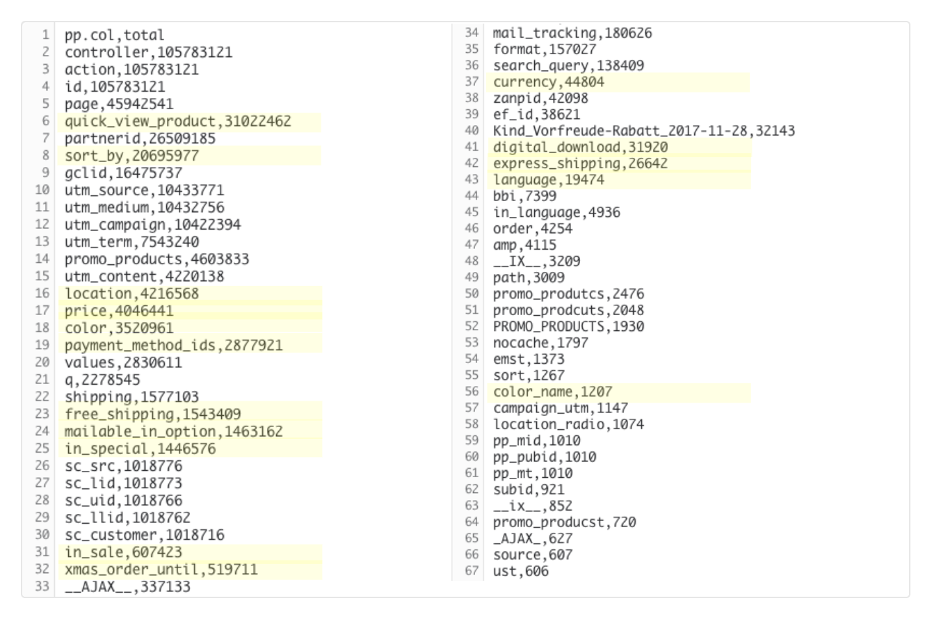
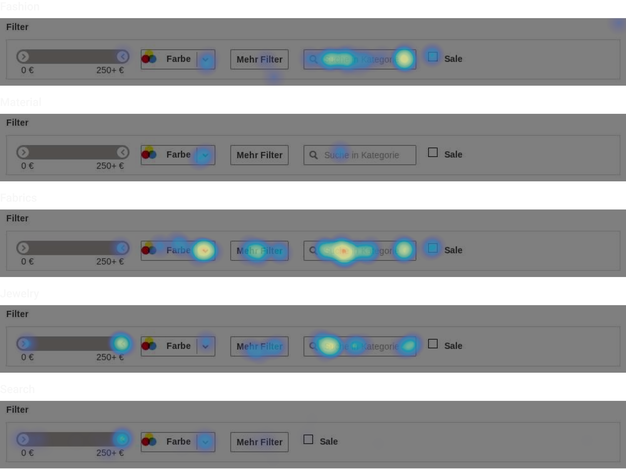
Based on the qualitative and quantitative data, we determined that some filters were universally relevant across all product categories. These global filters: price, color, location, shipping, and payment options would always be visible, regardless of the category.
In contrast, category specific filters would be positioned according to their relevance within a category. For example, in the Fashion category, filters like size, color, and material would take precedence, while in Jewelry, customizable options, material, and stones would be prioritized. This made sure that users could quickly access the most relevant filters for the product types they were interested in.
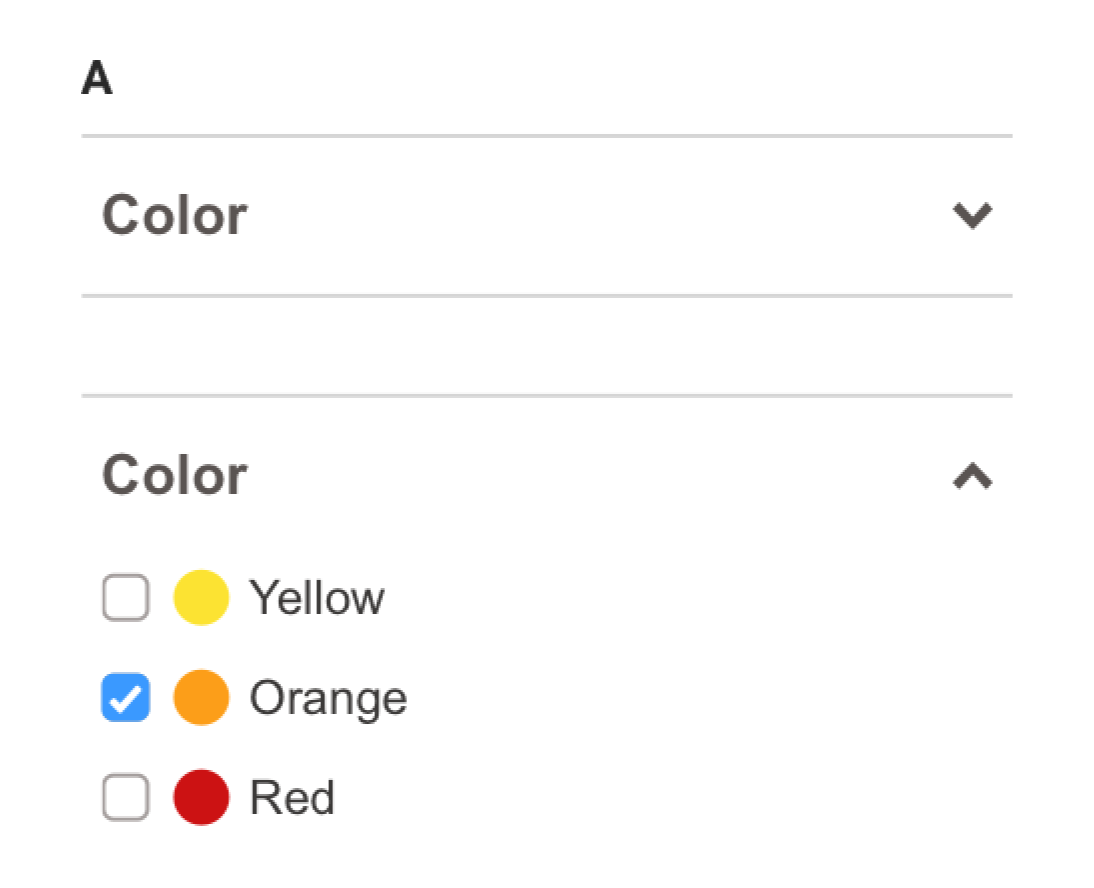
Quick Win: Improving the Color Filter
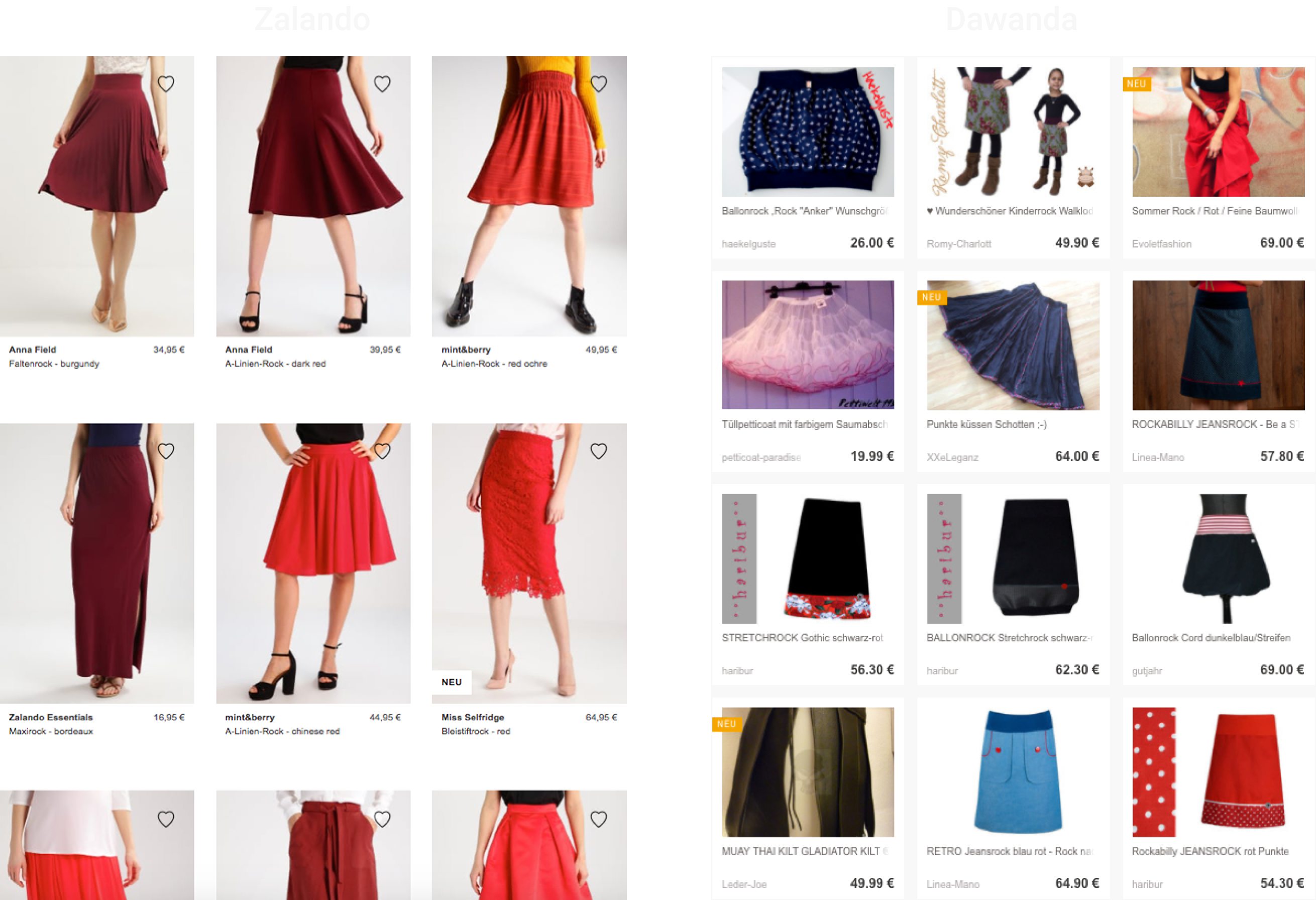
A big pain point we discovered during user research was filtering by color. Competitors, such as Zalando (example above), had a much more effective color filtering system, and it was clear we needed to improve ours.
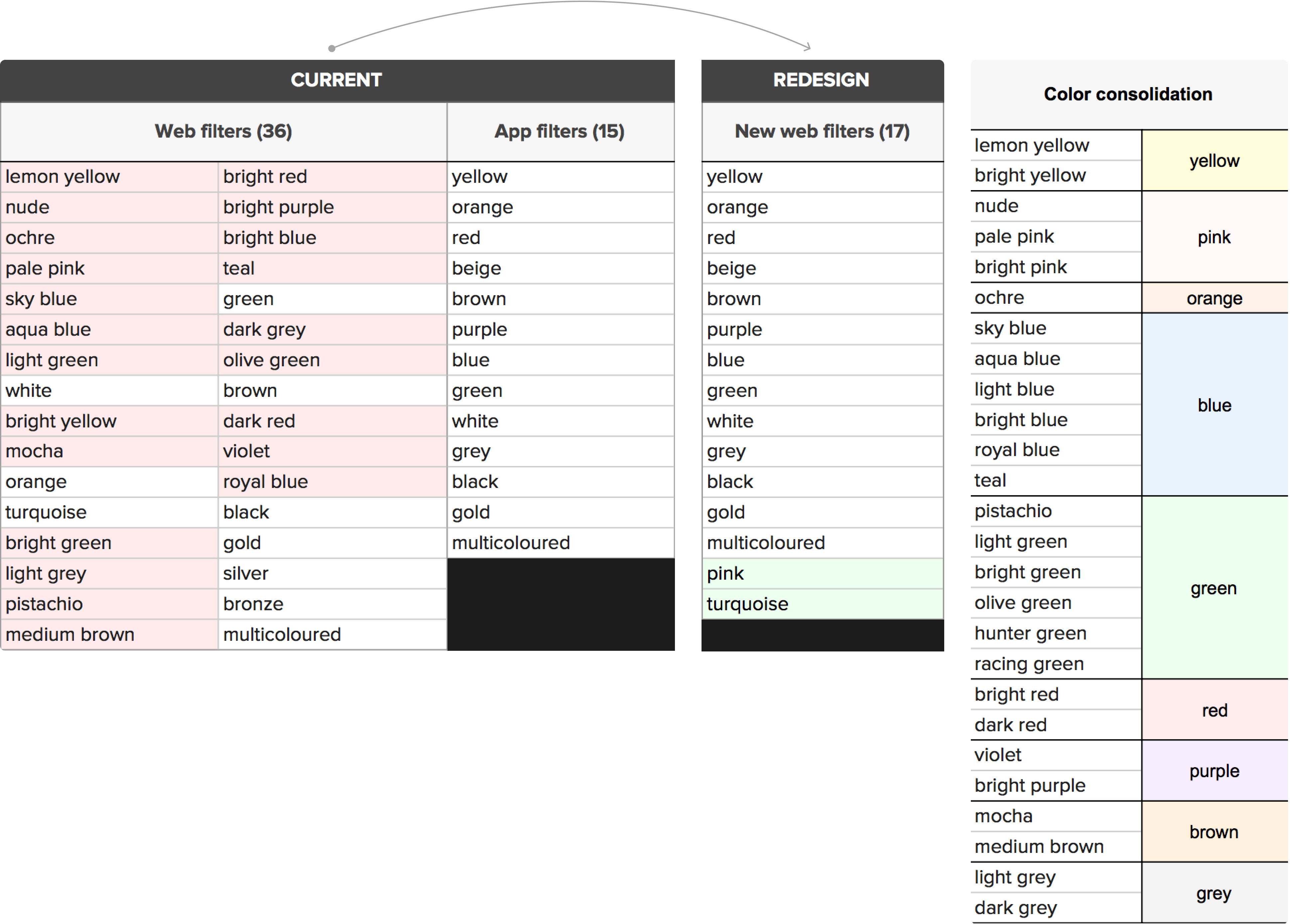
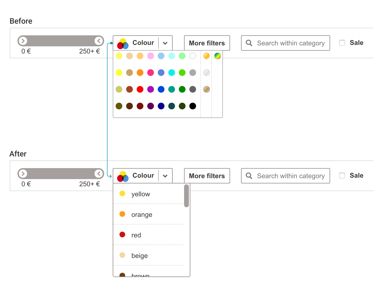
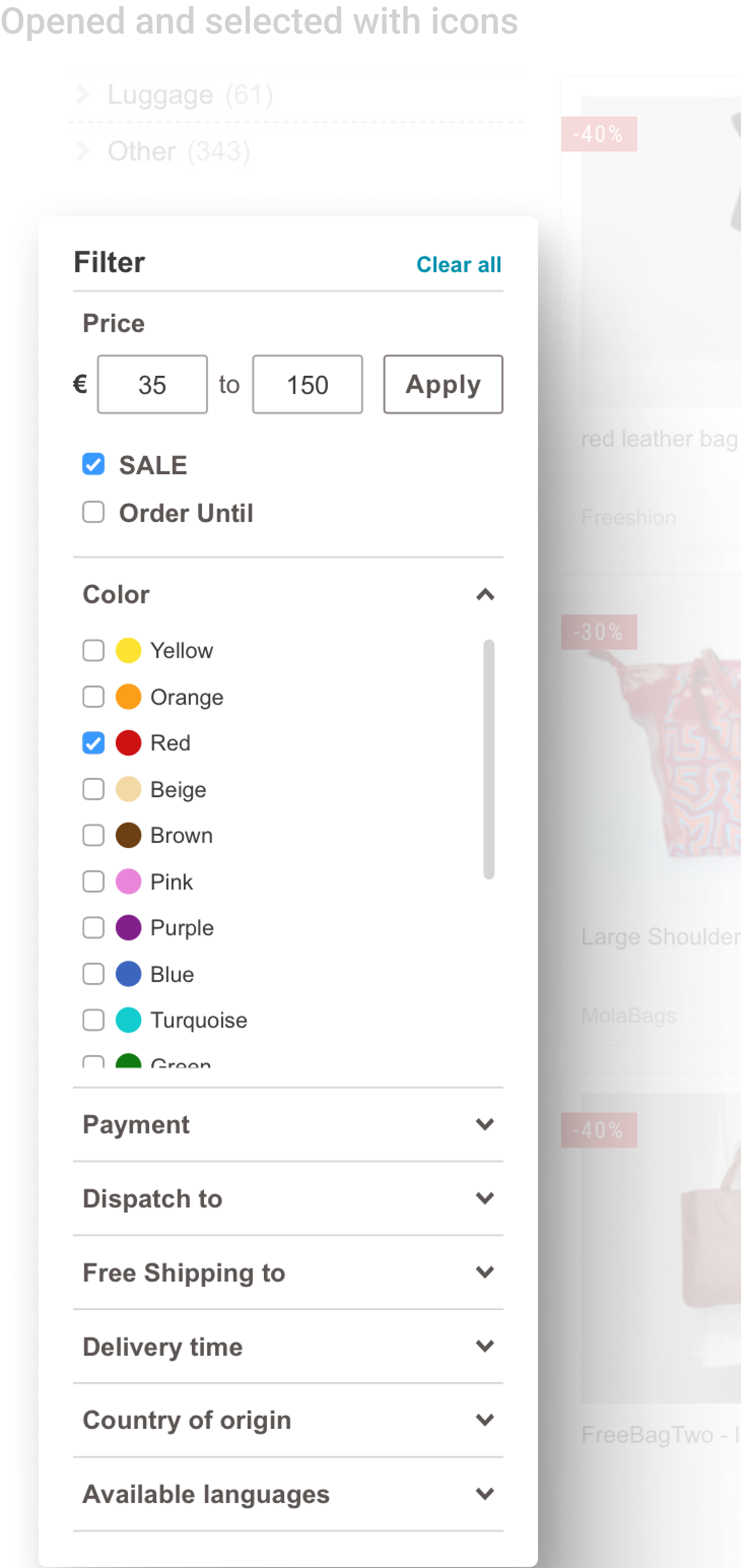
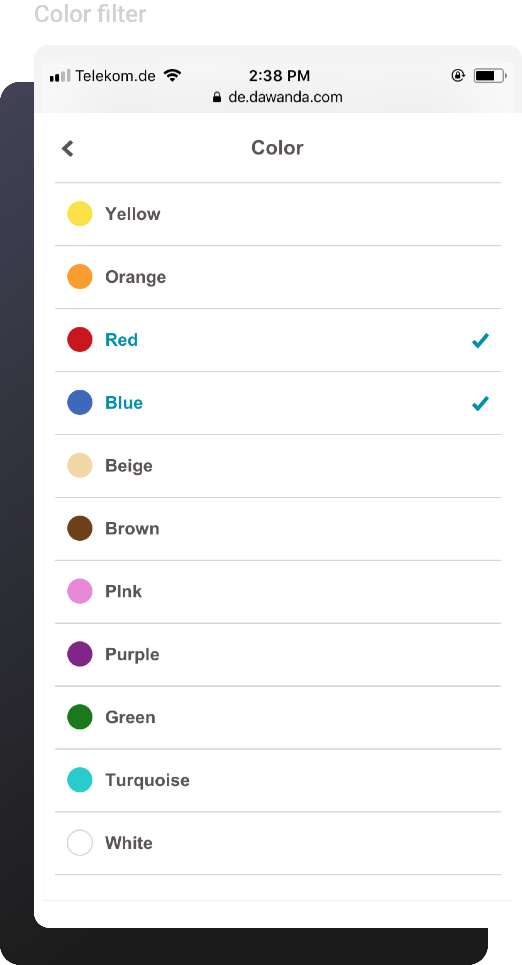
DaWanda’s mobile app already limited color filters to 15 key options, which worked well for users. For the desktop version, we adopted this approach but added two additional colors: pink and turquoise, based on user requests and the fact that many products on DaWanda featured those colors. The remaining 36 color options were kept in the backend for product listings but consolidated in the front-end UI. This ensured sellers could still tag products accurately without overwhelming users with too many choices.
Final Results
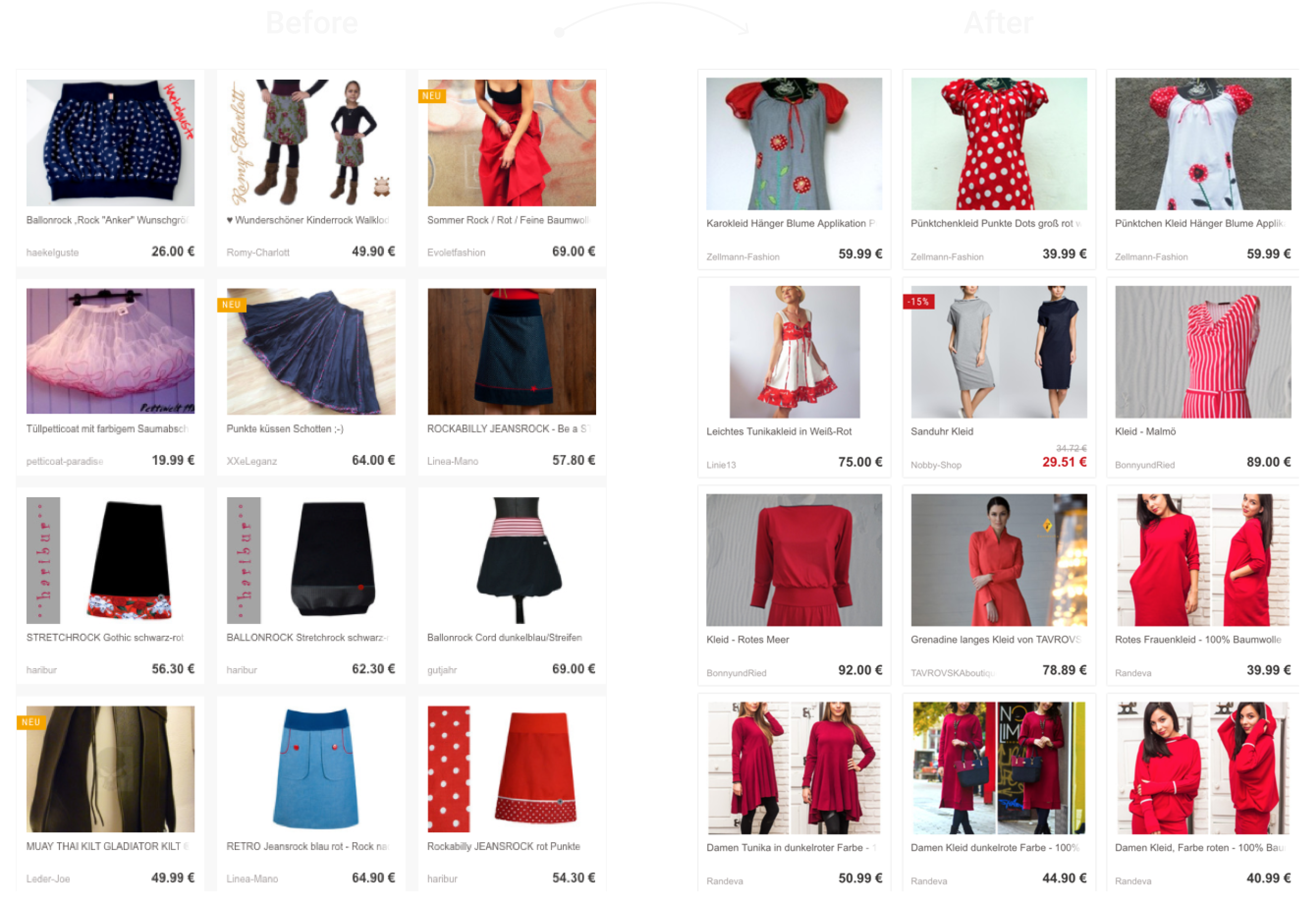
The changes brought on positive results for DaWanda. It was important for our seller relations team to communicate with sellers, reassuring them that products listed under the old color options would remain available and searchable. The color accuracy of filtered products improved greatly, and we received positive feedback from buyers.
DESIGNING
Based on our findings the team and I agreed to move forward with designing the new filters that addressed these core issues:

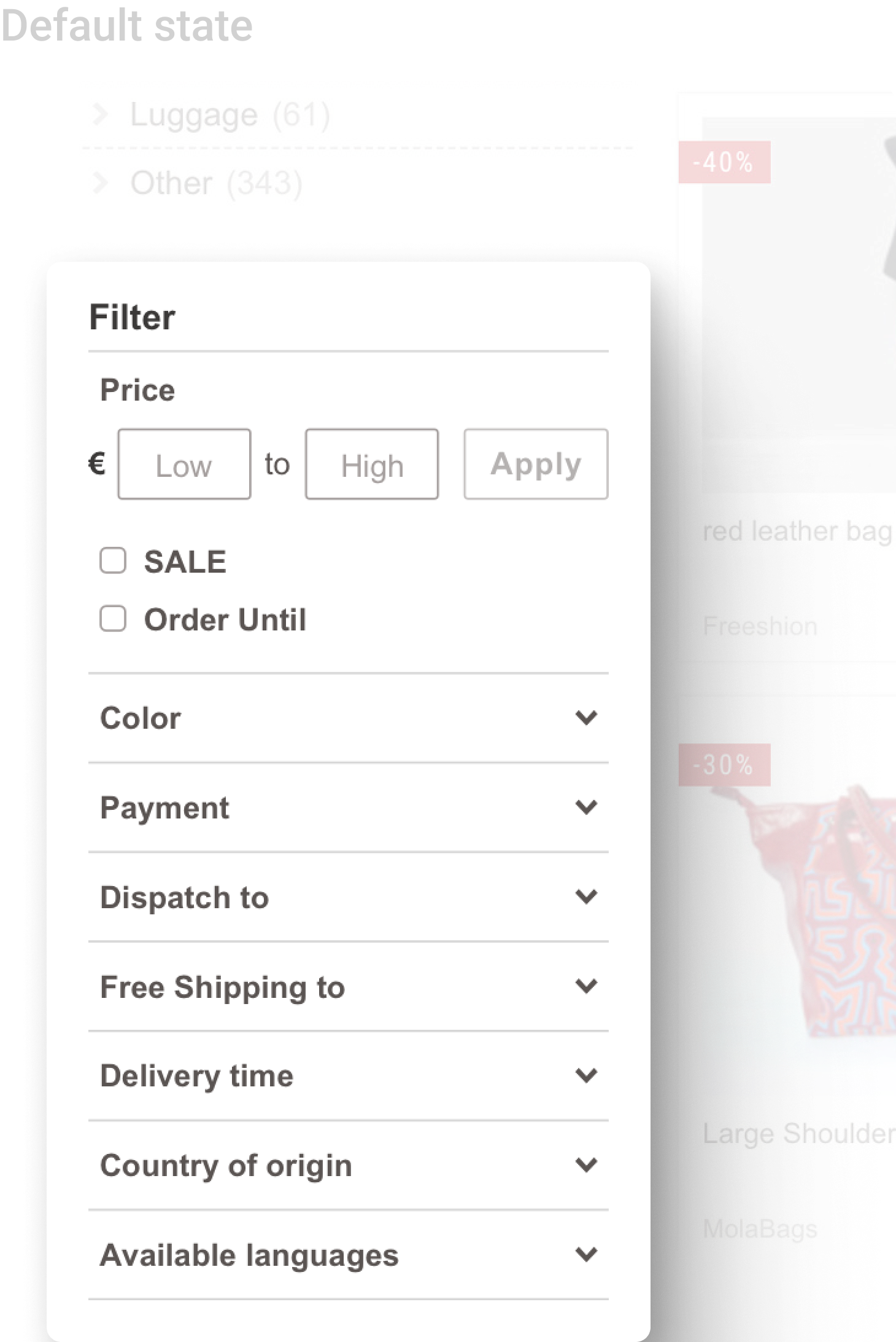
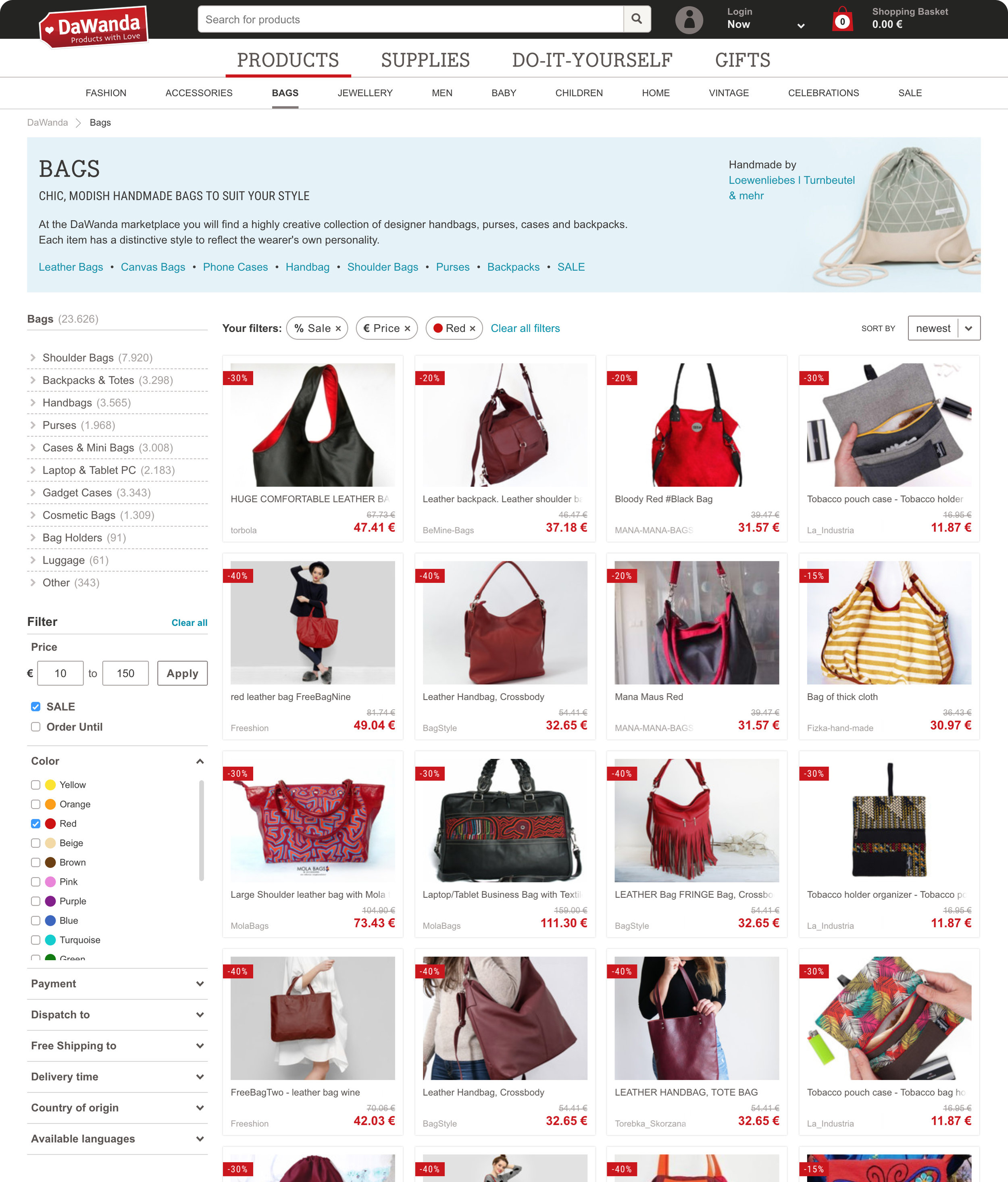
Visibility: Filters would now be positioned on the left-hand side of the page, under the category tree, making them more accessible and visible immediately upon landing on search or category pages.

Adaptive: Filters would dynamically update based on users' selections, preventing the frustration of selecting filters that resulted in no available products.

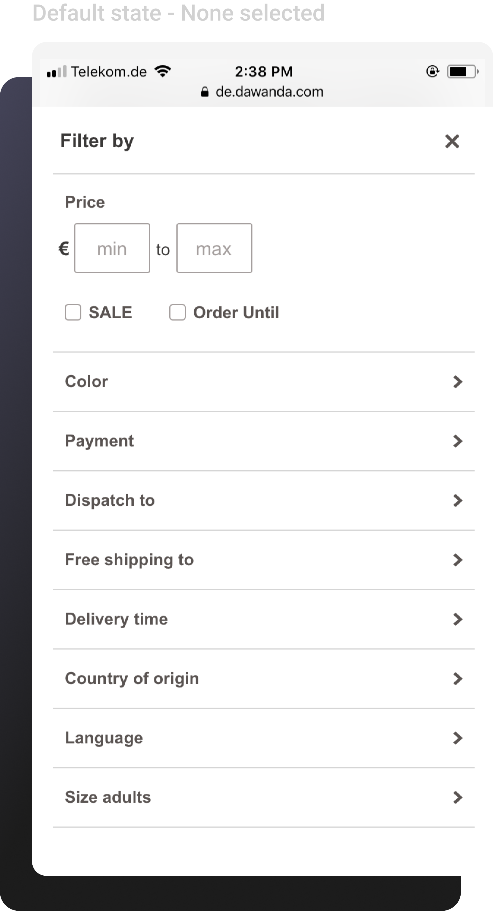
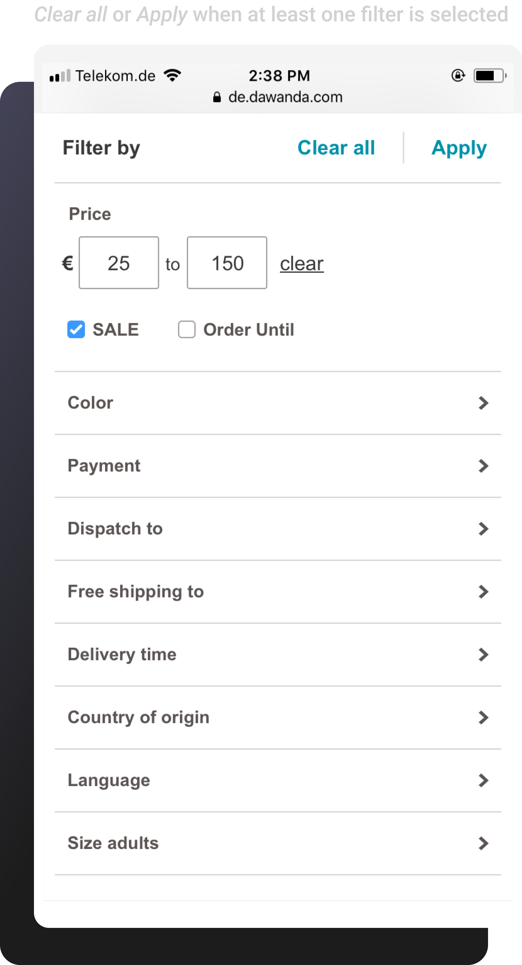
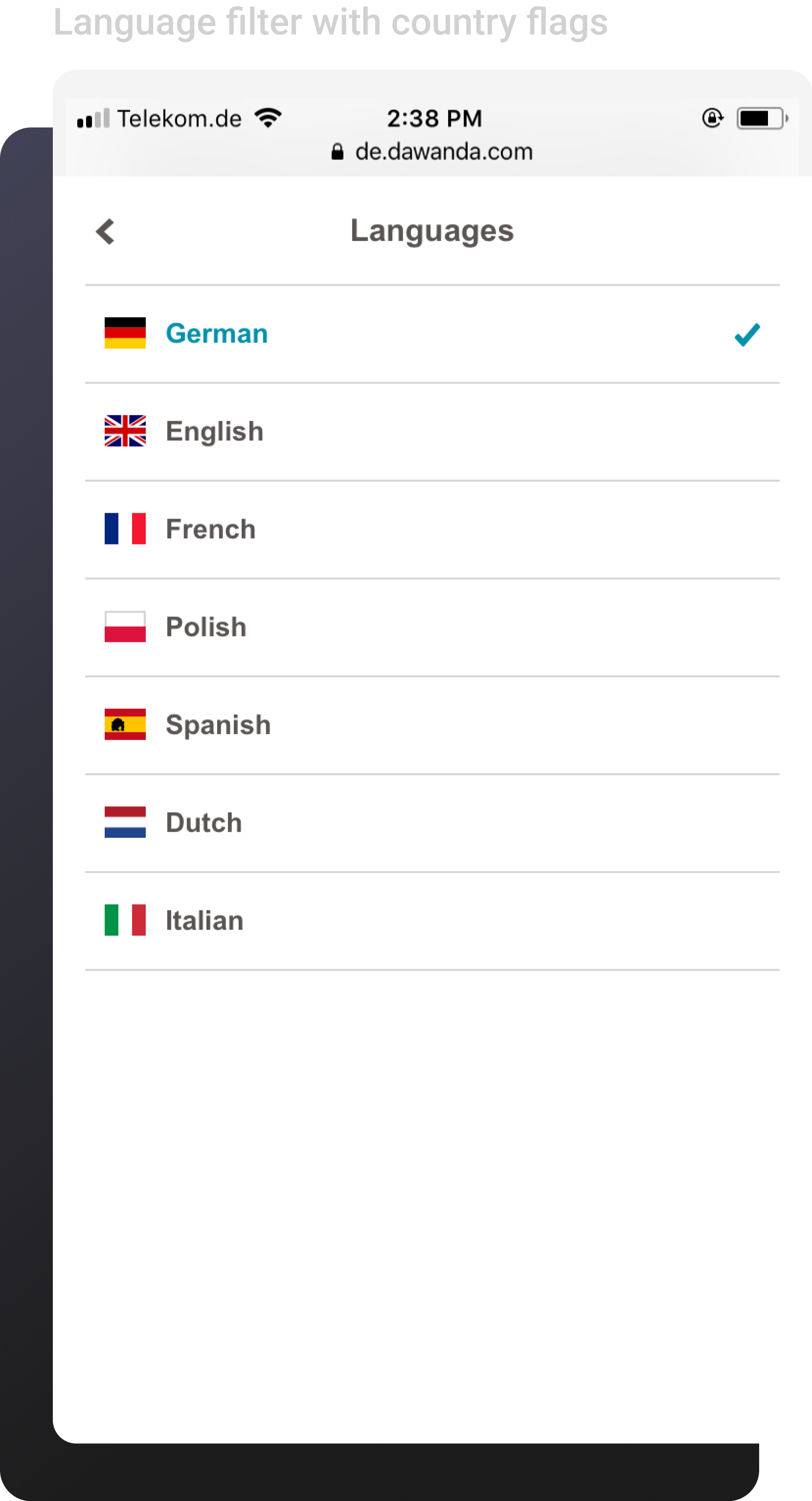
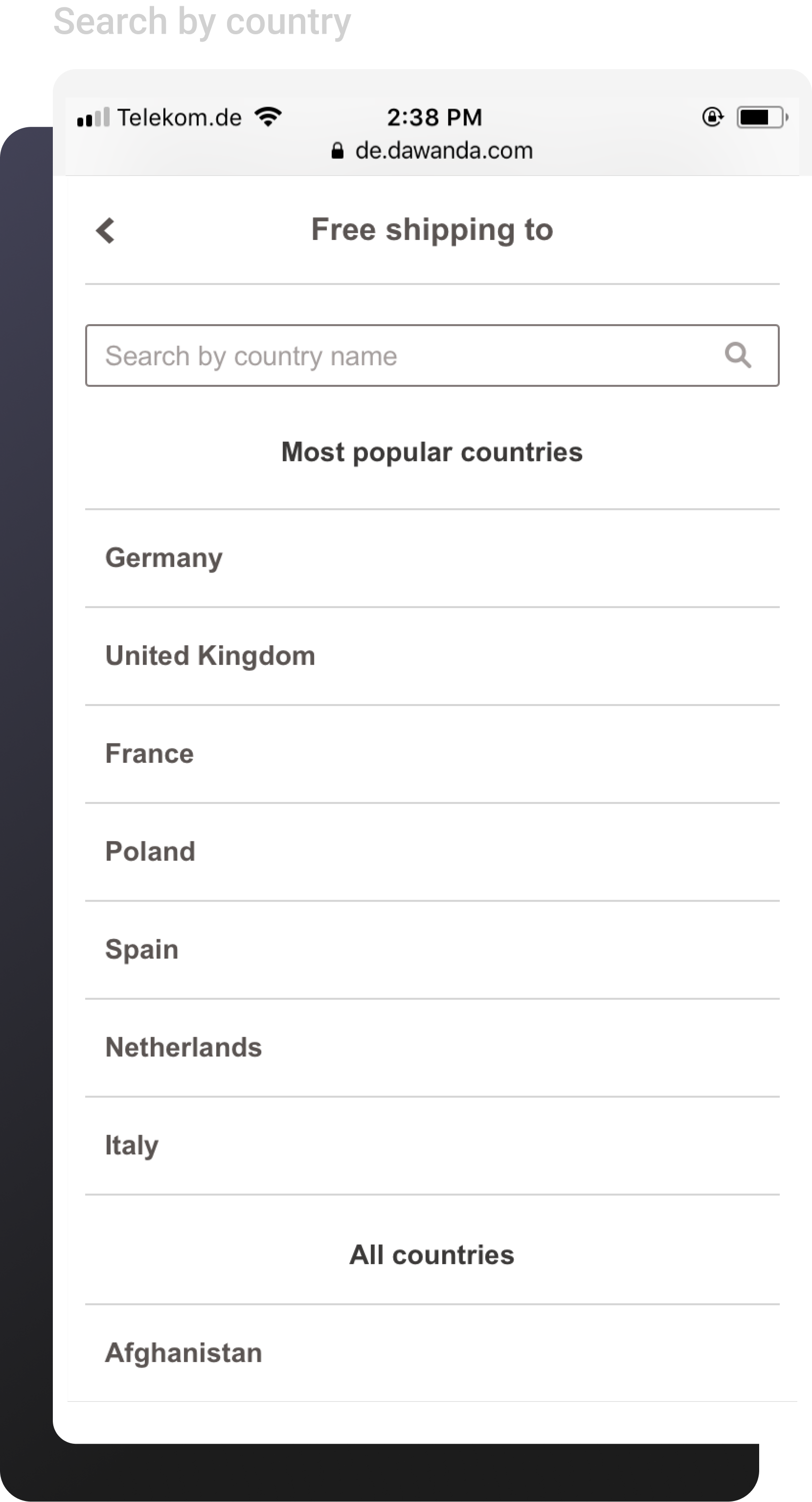
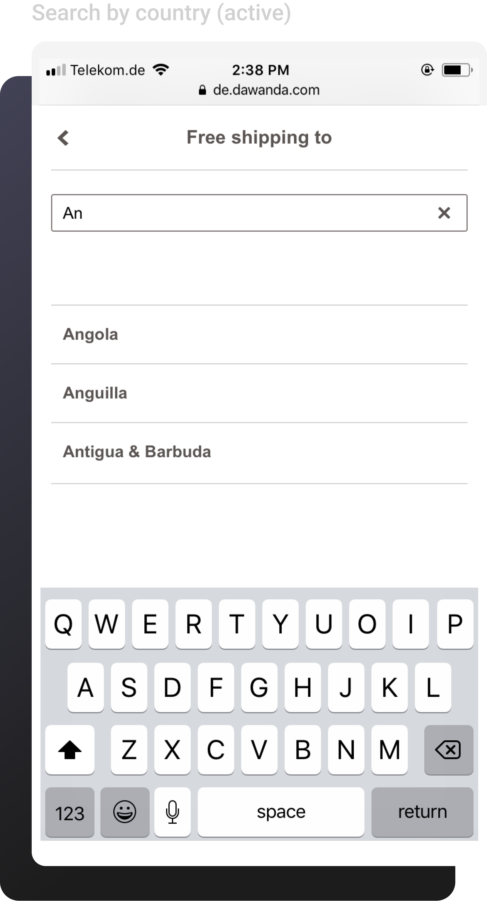
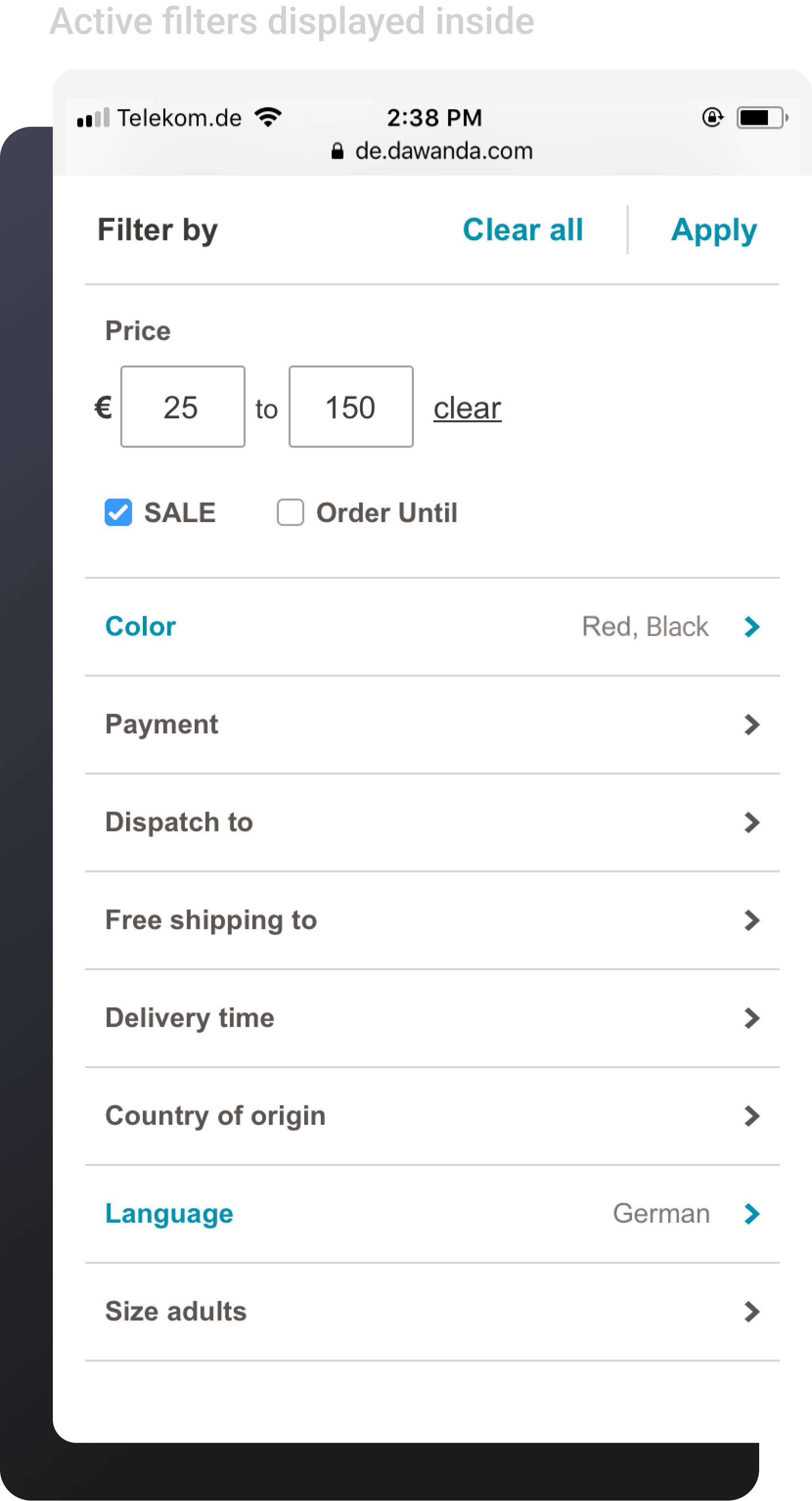
Mobile-Friendly: We created slightly different designs for mobile, ensuring the filter experience was optimized for smaller screens.

Developer-Friendly: The new filter component would be built from scratch using React.js library, allowing us to avoid the limitations of legacy code providing greater flexibility for design and engineering.
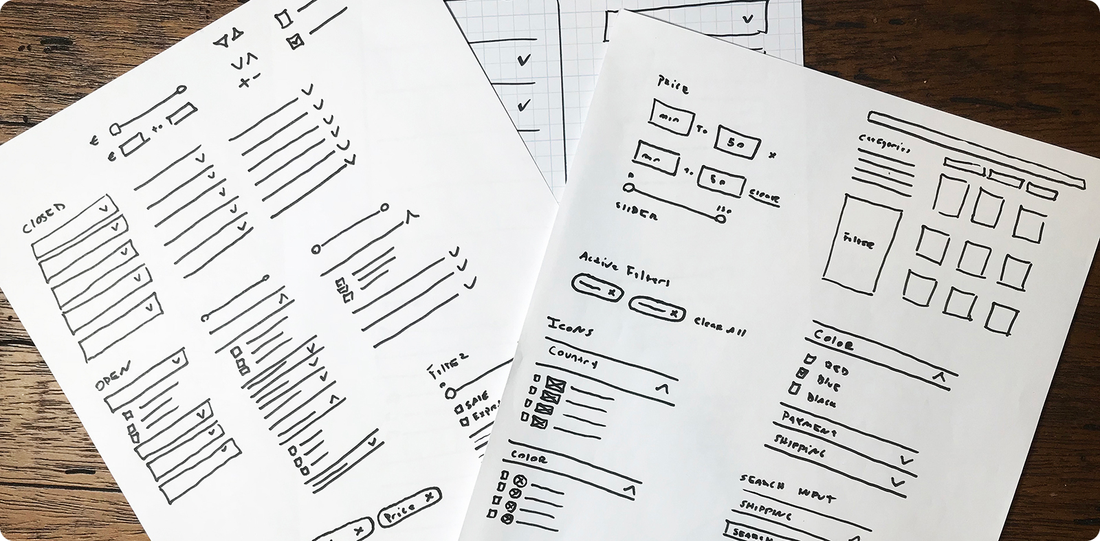
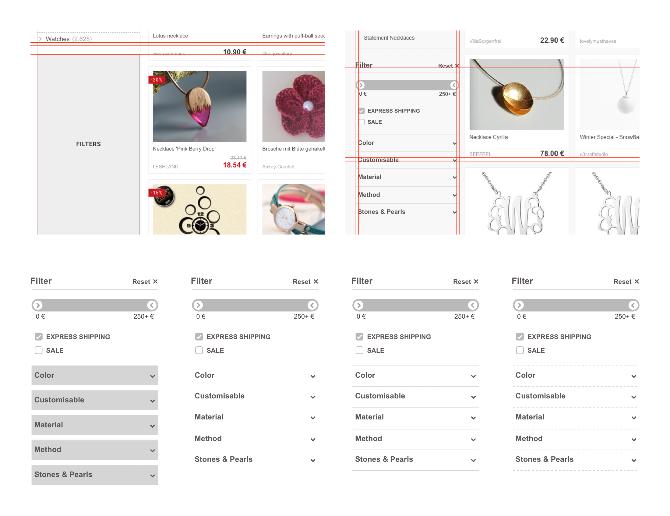
First Draft Designs
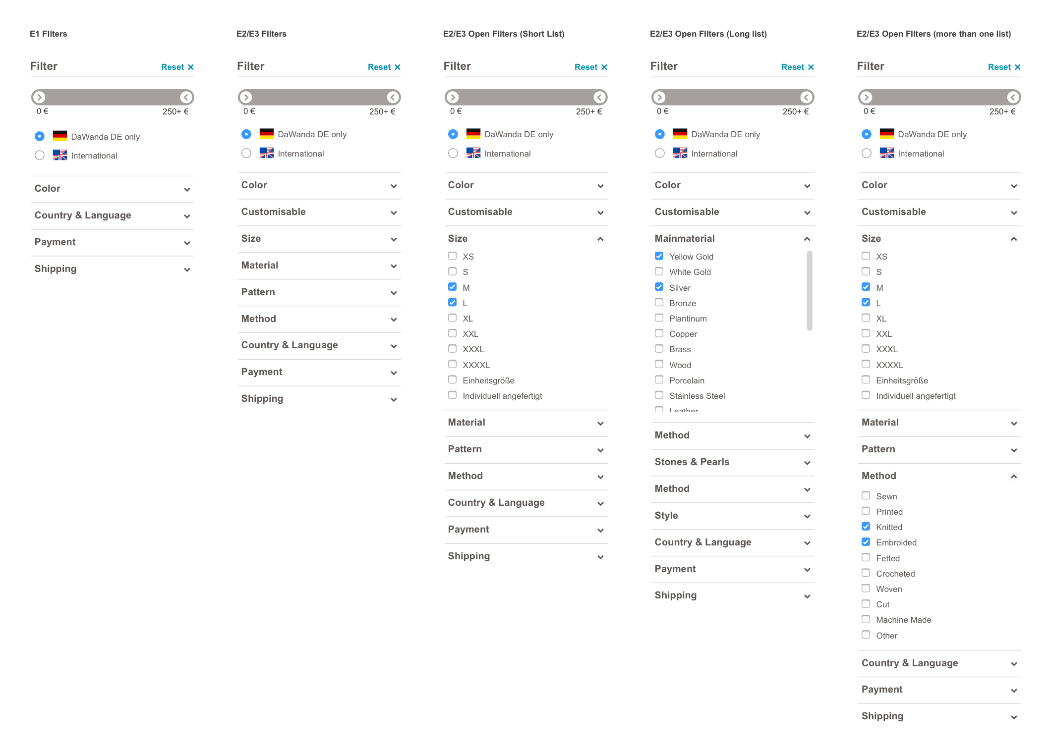
Variations

Design Decisions
Throughout the design process, we explored multiple variations. Here’s how we made final decisions on these key components:
Price component
We opted for input fields instead of the original price slider, which had caused usability issues on mobile devices. Users often accidentally navigated away from the page or struggled with the slider's lack of precision, as it only allowed increments of 5. The input fields provided more accuracy and prevented accidental actions.

Active filter signifier
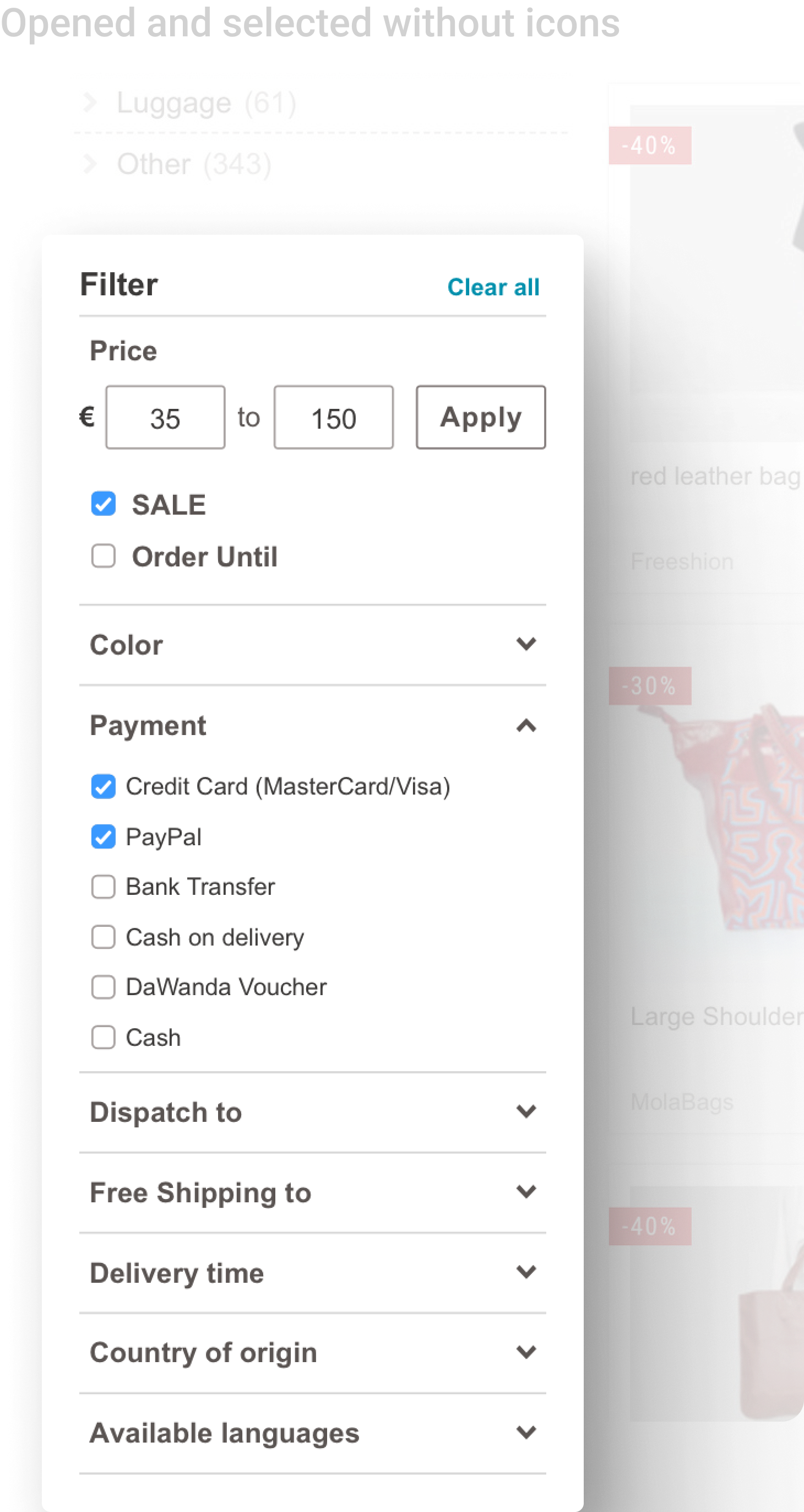
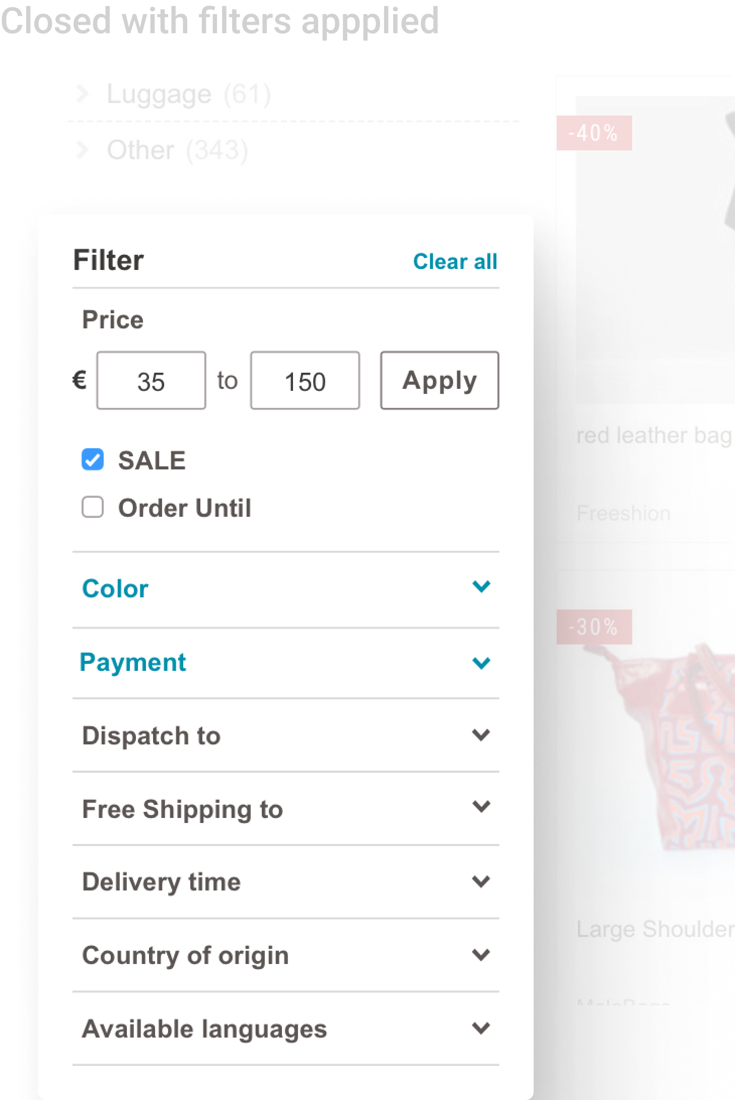
To make it easier for users to identify when a filter was active, we decided to highlight both the filter name and the dropdown icon. This dual highlighting made the active filters more noticeable. Initially, I had only highlighted the icon, but the team decided that it wasn’t prominent enough.

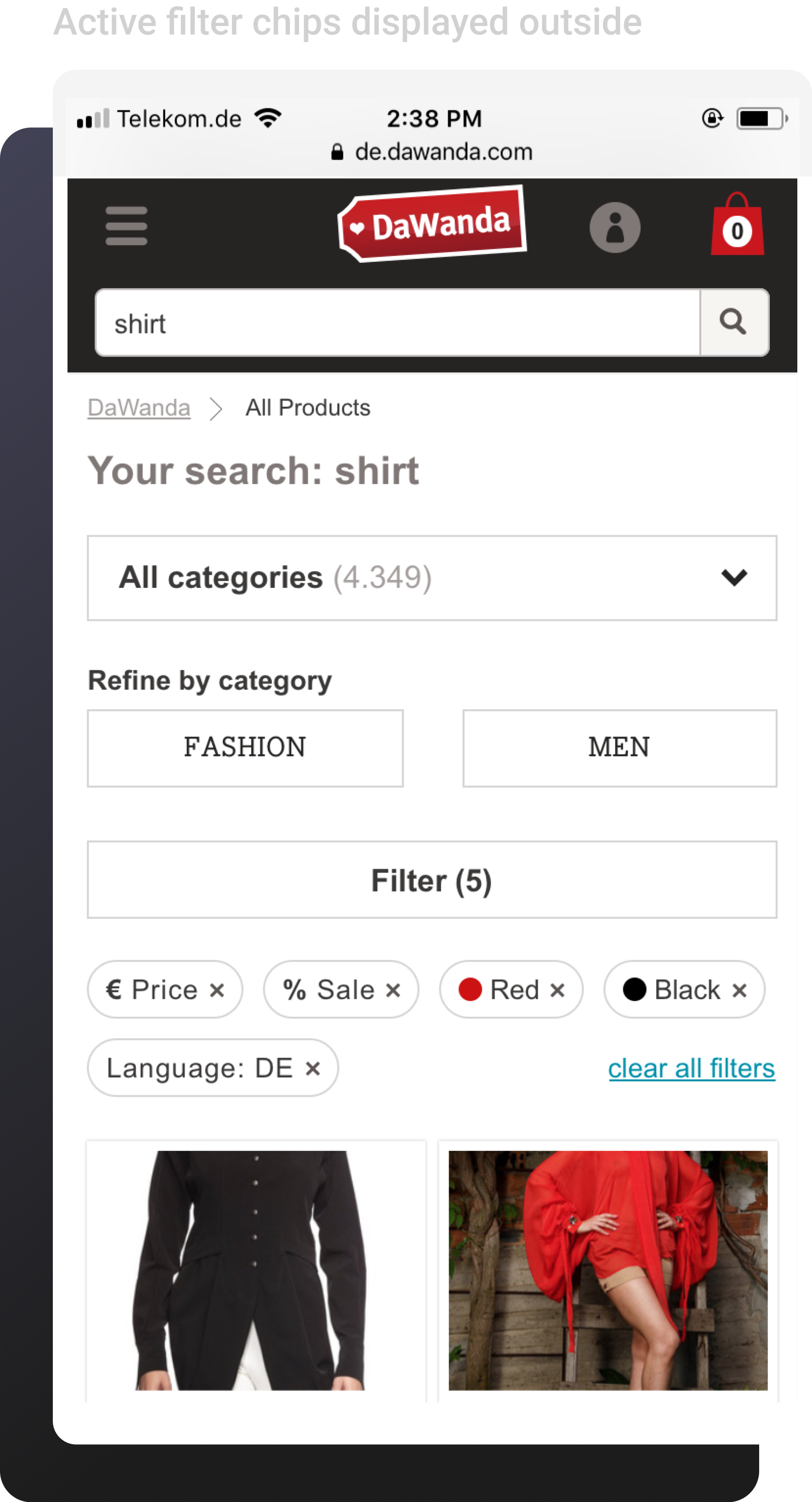
Active filter chips
The fully rounded design for filter chips emerged as the most popular of the design variations. DaWanda had used square components since its inception, but we felt it was time to modernize the look with the rounded style.

Filter expand icon
I initially considered using "+" and "–" icons to indicate expanding and collapsing filters. However, feedback suggested that the "+" symbol was often interpreted as "add" rather than "expand." We switched to using up and down arrows, which conveyed opening and closing more clearly and followed standard icon conventions for this type of interaction.
FINAL DESIGNS
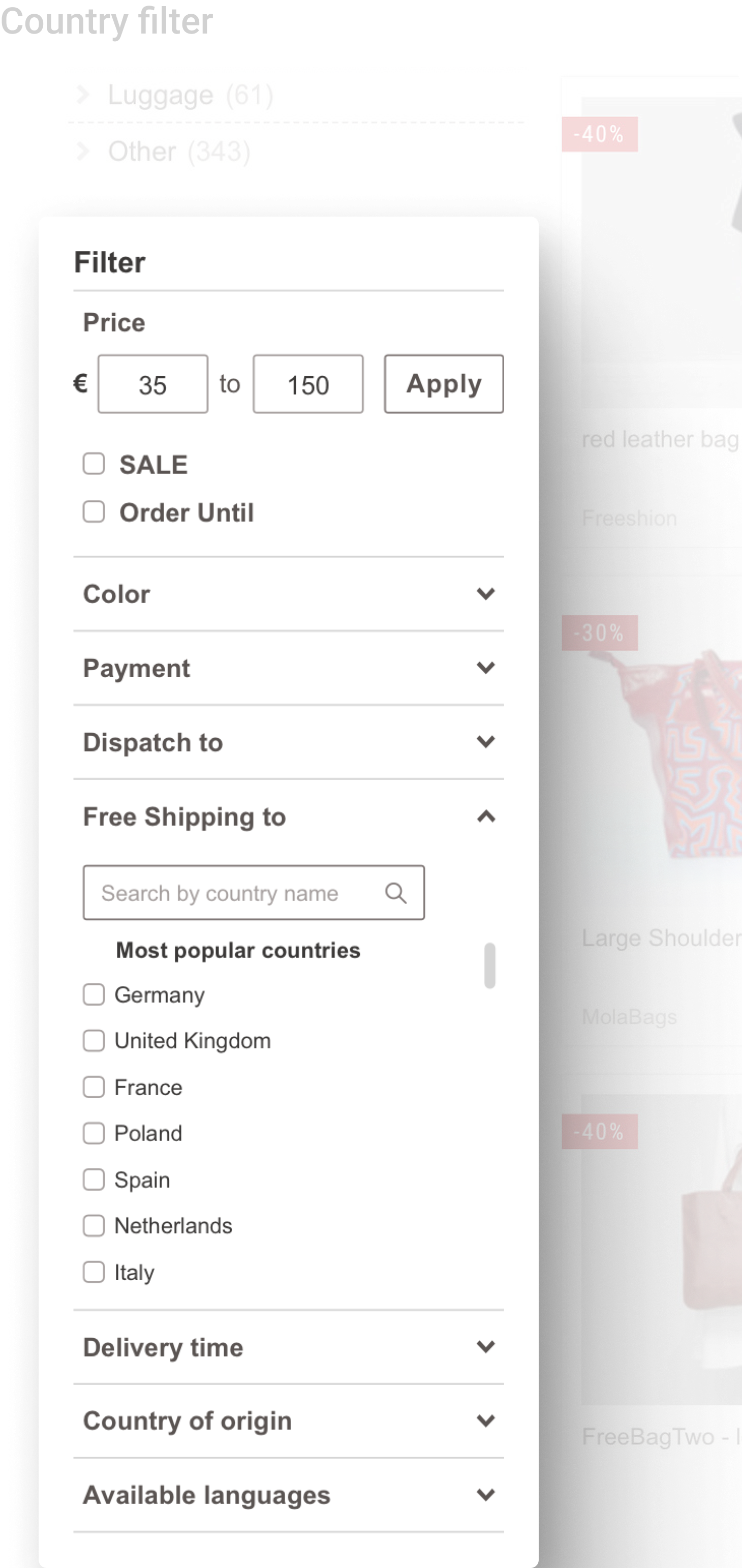
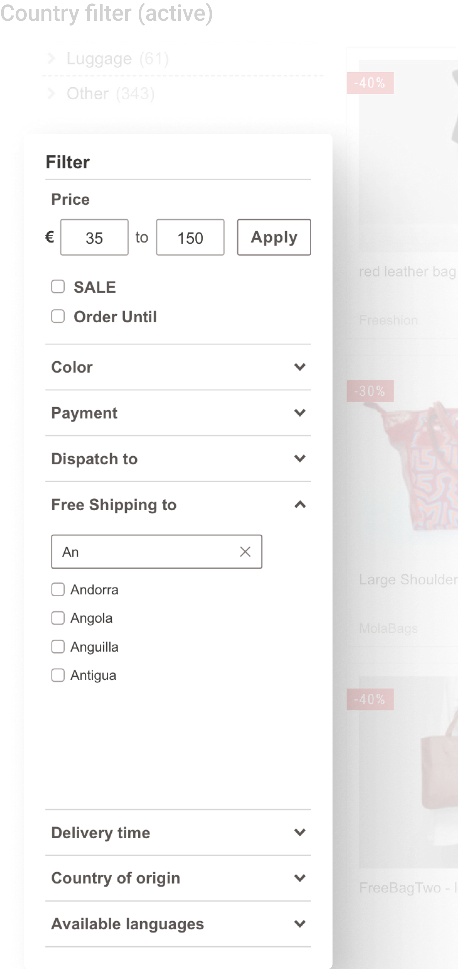
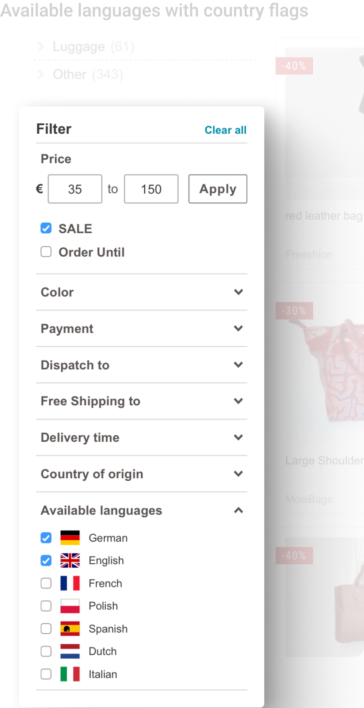
The team and I were able to deliver an improved filtering experience, making it easier and more efficient for our users to search and discover products. By improving filter visibility and addressing key pain points, the changes quickly led to enhanced search accuracy, a reduction in ‘no results’ pages, and higher satisfaction for both buyers and sellers.
Desktop
Mobile


END // END // END