
Arrival
2015 • NYC • Student project
Designing
for the Apple watch
OVERVIEW
We were tasked with designing and prototyping a wearable app that would be both functional and realistic. Initially we envisioned a communication tool for cyclists, but the project evolved into a more universal solution aimed at helping anyone meet up on time. Given the lighting fast advancements in wearable technology, it was critical that our design adhered to Apple’s Human Interface Guidelines (HIG) and was feasible for real-world use. To ensure this, we conducted research, analyzed similar apps, and tested various wearables firsthand in stores around New York.
My Role
My role included a variety of tasks, including conducting Contextual Inquiry, User Interviews & Testing, Card Sorting, Competitive Analysis, creating an Interactive Prototype, and collaborating on Hi-Fi Designs.
DISCOVERY
Competitive Analysis
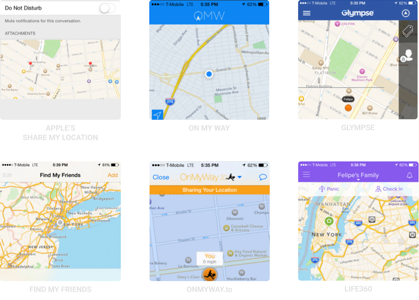
We studied and used six different popular location sharing apps that are currently out in the app store. We wanted to find which worked and which didn’t. We knew for certain that Arrival would not require a mandatory signup or include messaging since a keyboard is not available on the apple watch. With a tight ten-day timeline for this project, we were also tasked with selecting an existing app to use as inspiration for our branding and color palette. We chose Glympse for its simplicity and clean design, which aligned well with our vision for Arrival.

The Platform
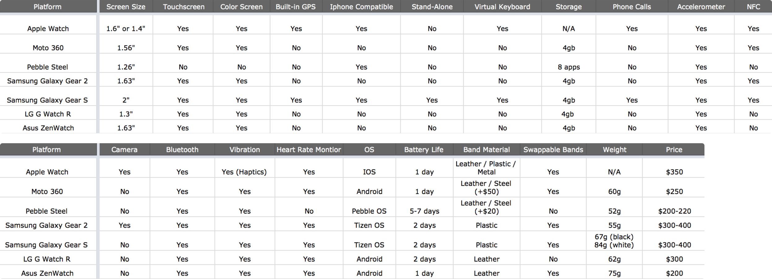
We had the flexibility to design an app for any wearable, so we began by researching a variety of options to determine the best fit for Arrival. We tested multiple Android smartwatches in-store, watched keynotes about upcoming wearables, including the Apple Watch, and read online reviews and 'best of' lists.
After conducting user interviews, we chose the Apple Watch for two primary reasons:
- Our user interviews revealed that 75% of participants owned an iPhone and indicated they would likely choose the Apple Watch if they were to buy a wearable.
- Apple’s patented Taptic Engine utilizes haptic feedback to let users know when and which direction to turn without them having to look at their watch. Since Arrival includes turn-by-turn navigation, this feature would provide the best experience for our users.

IDEATE
Personas
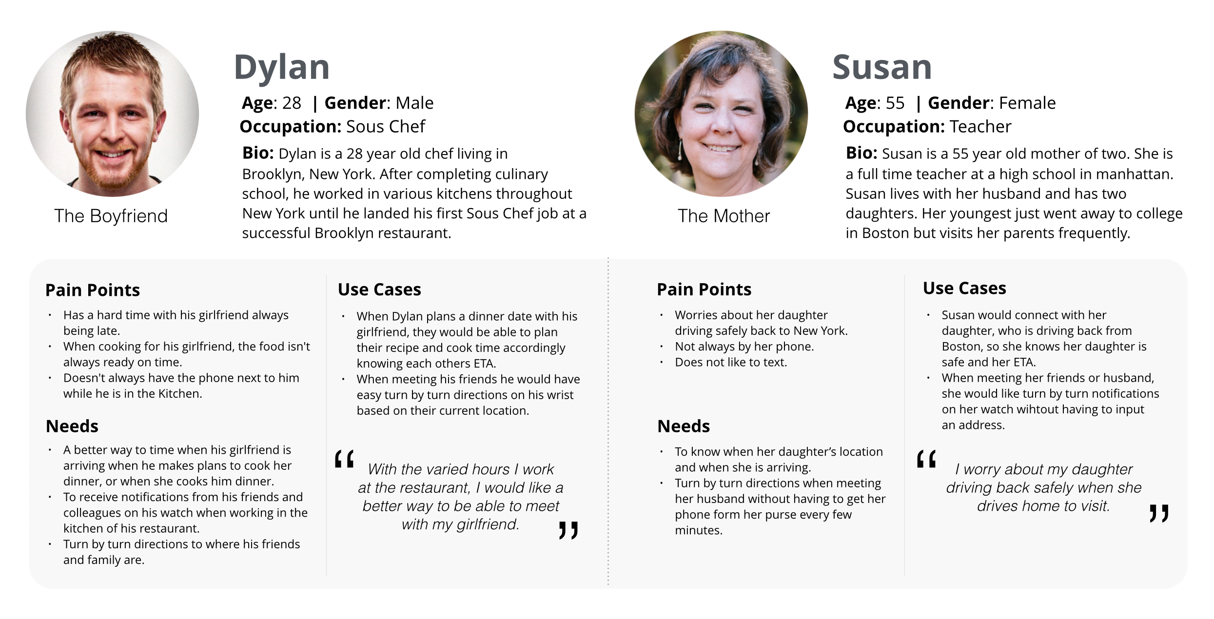
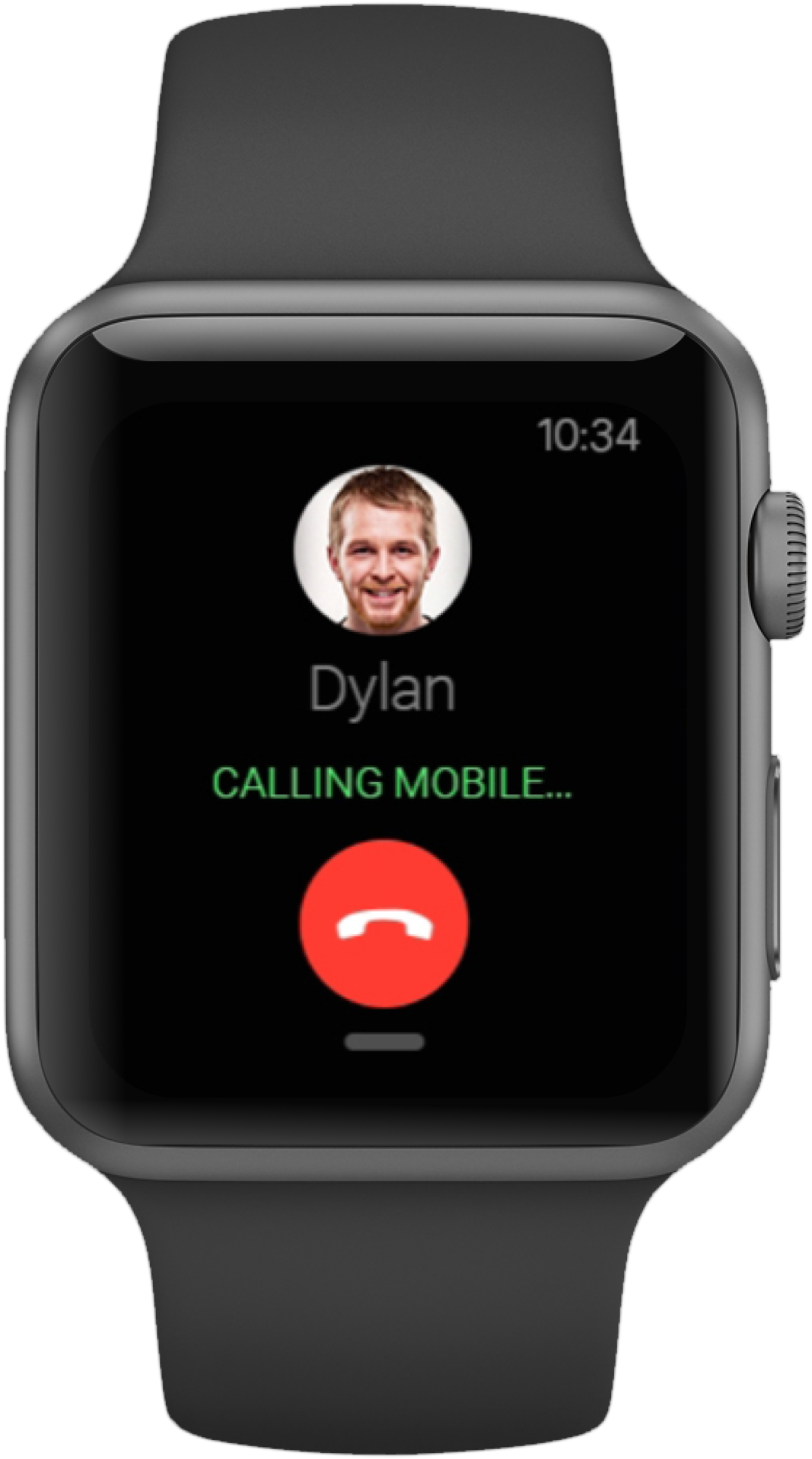
Based off our research and user interviews, I created personas and situations in which Arrival would prove useful. The Task Flow and Prototype below are based on Dylan's user journey, in which he is heading to his Girlfriend’s new apartment for a dinner date.
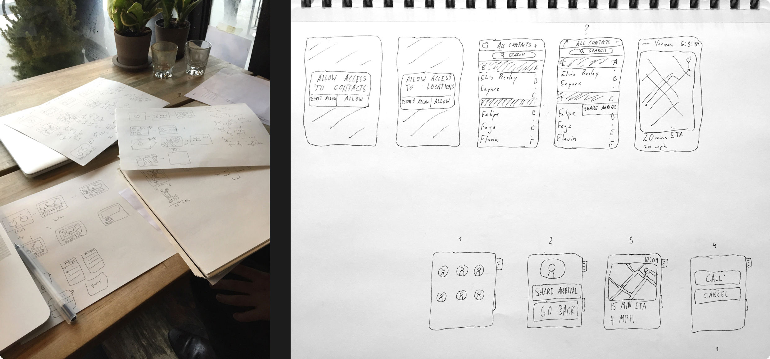
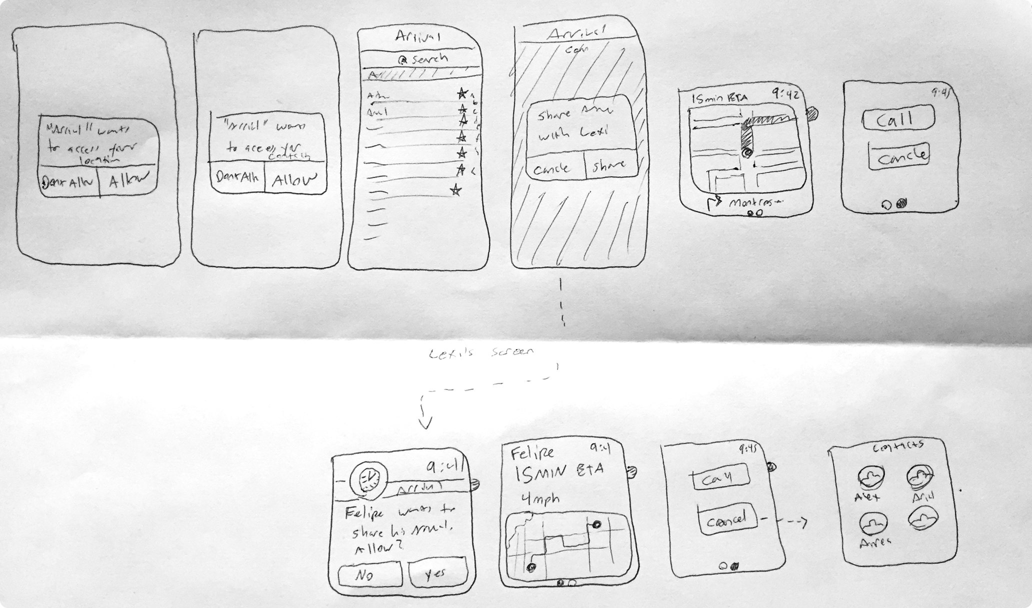
Sketches
DESIGN
Task Flow
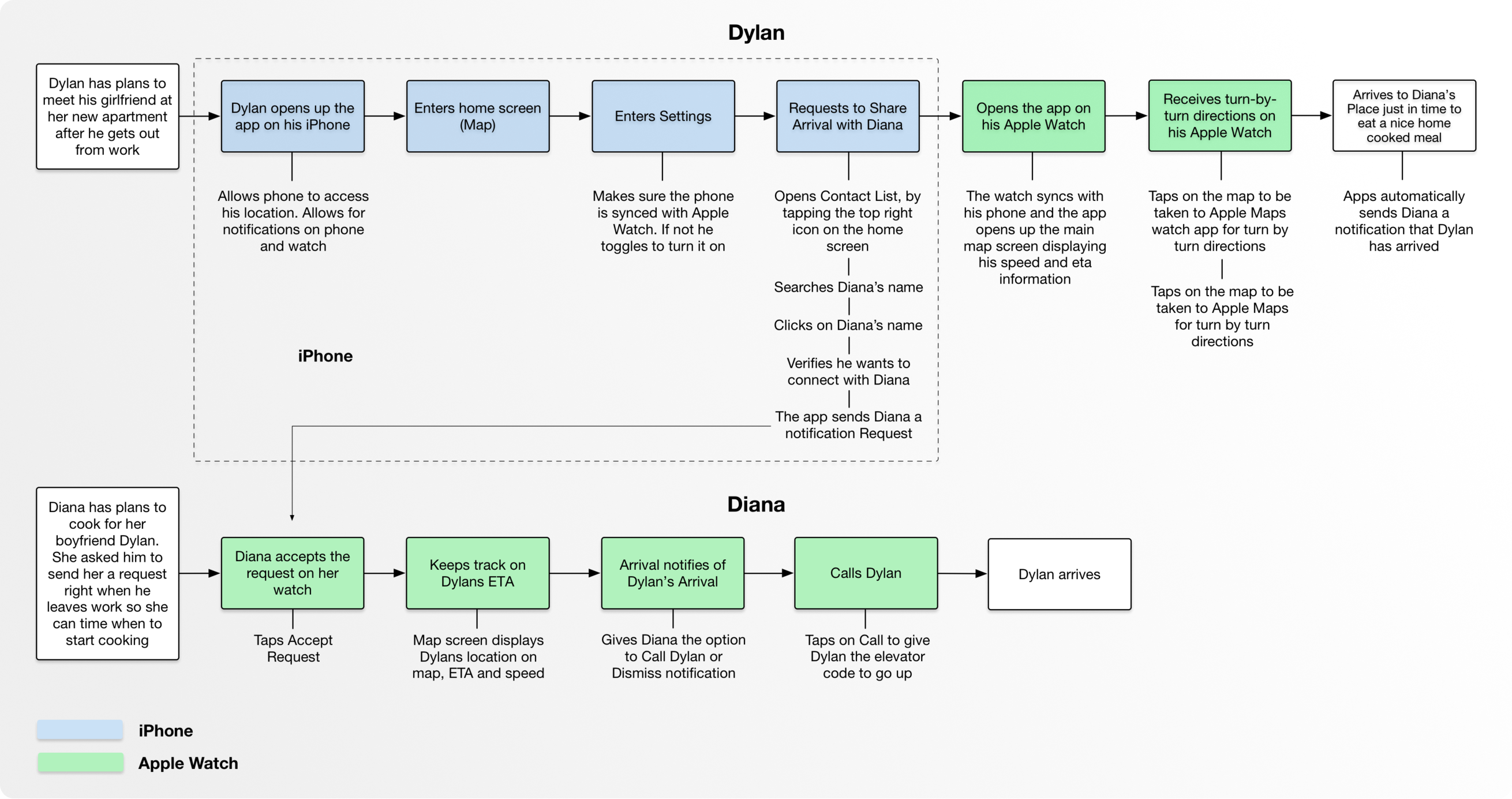
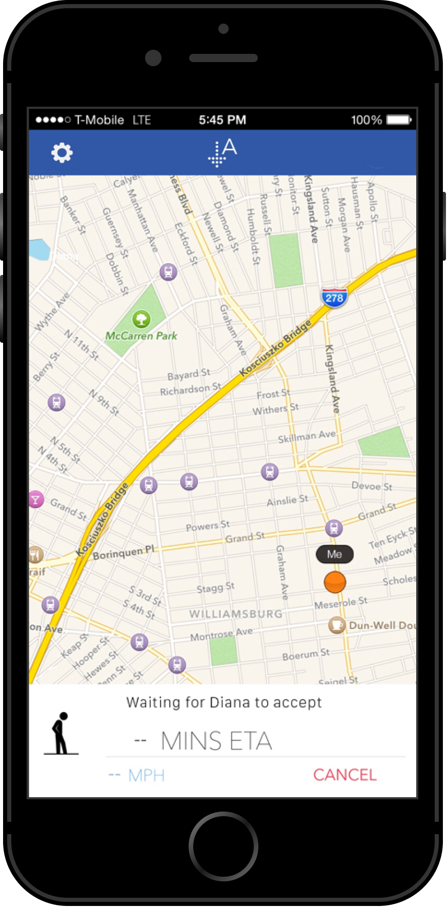
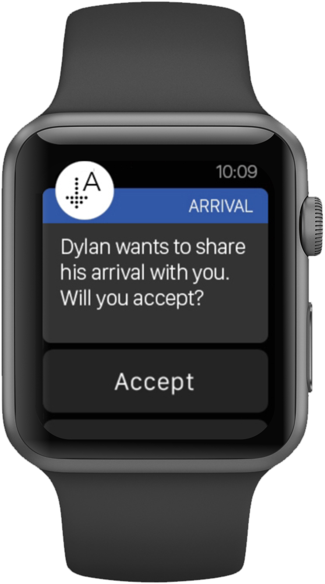
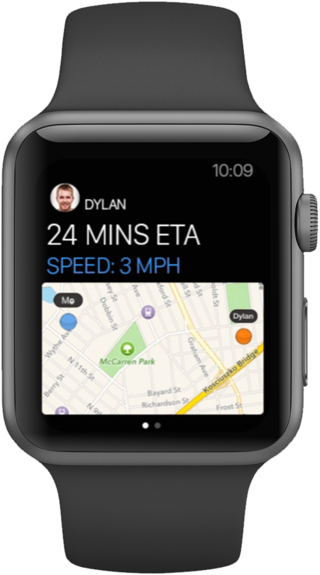
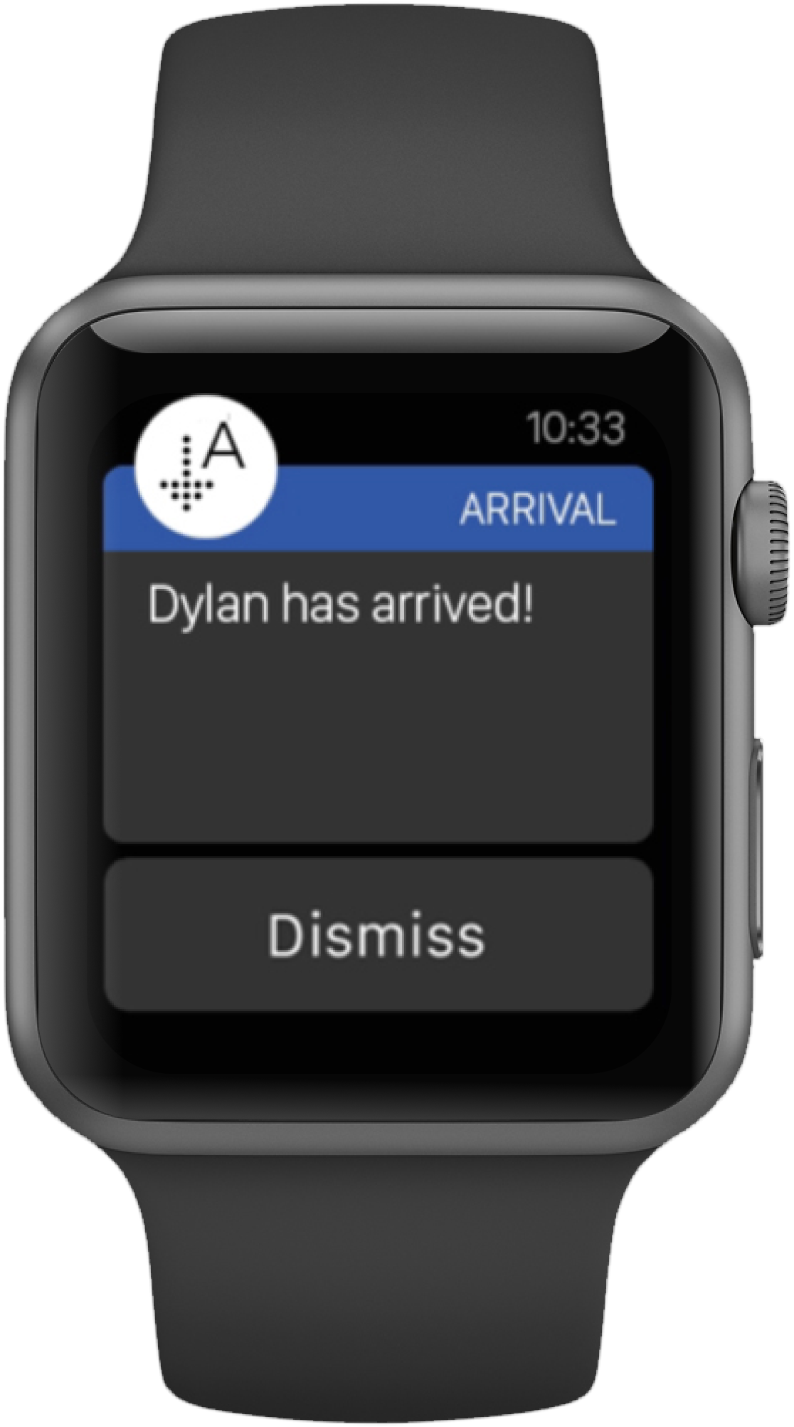
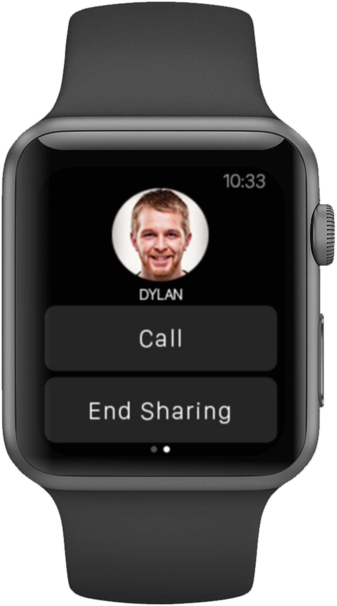
This task flow illustrates how Arrival helps Dylan and his girlfriend Diana coordinate their meet-up. Dylan is on his way to Diana’s brand new apartment for a dinner date, a location he hasn’t visited before. Using Arrival, Dylan can easily follow turn-by-turn directions to arrive on time, while Diana can monitor his progress and prepare for Dylan to arrive.
App Map
User Testing
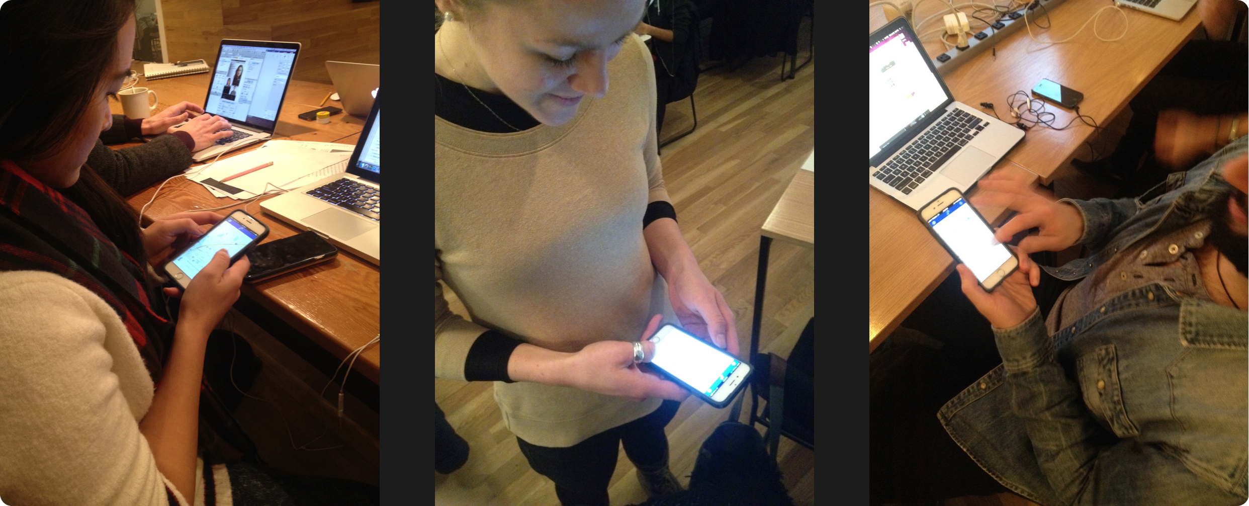
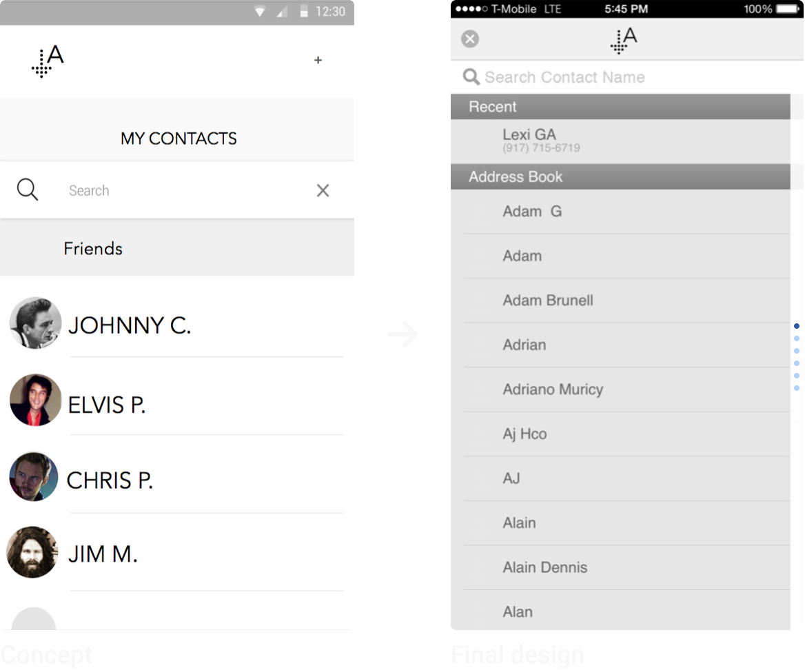
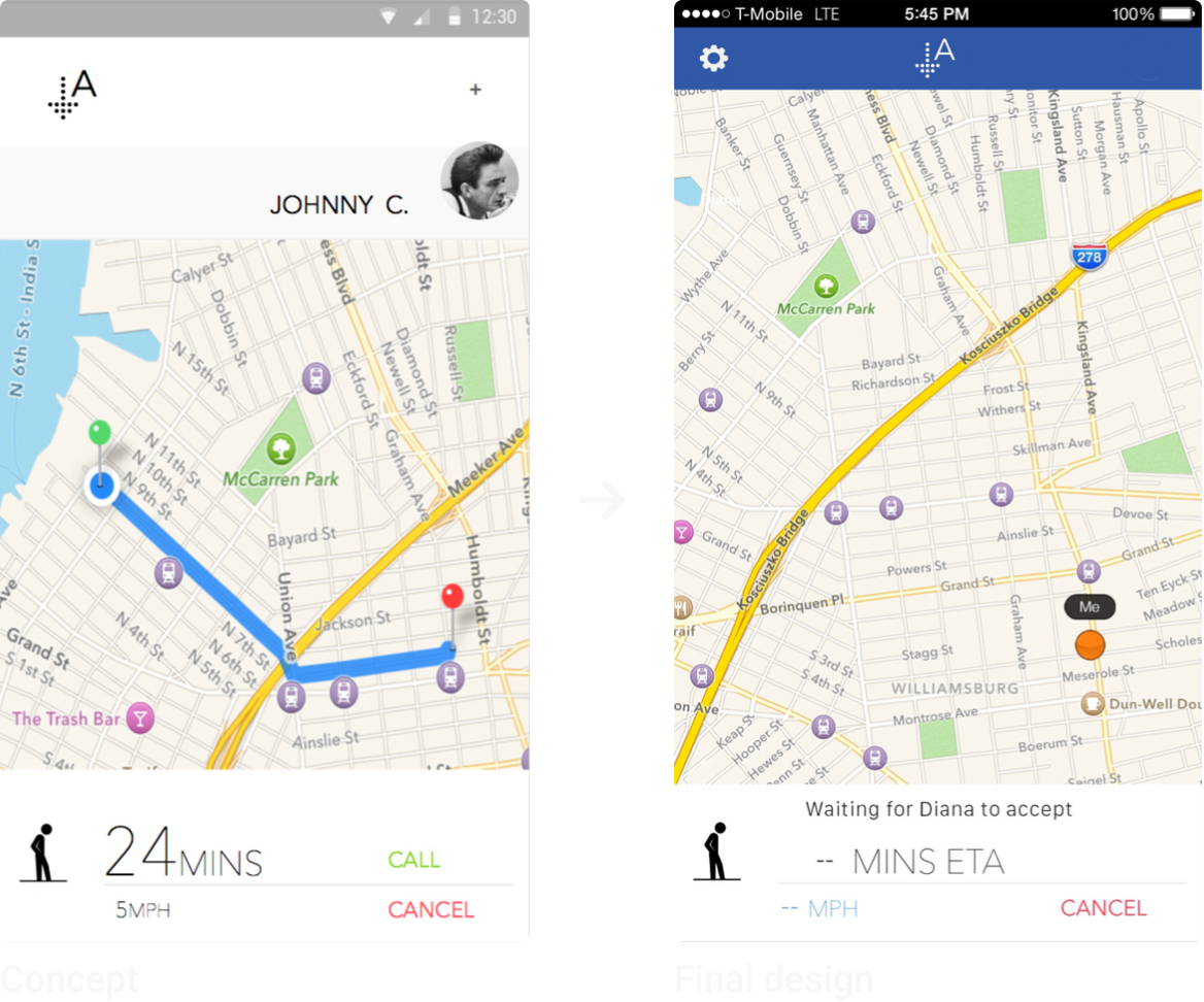
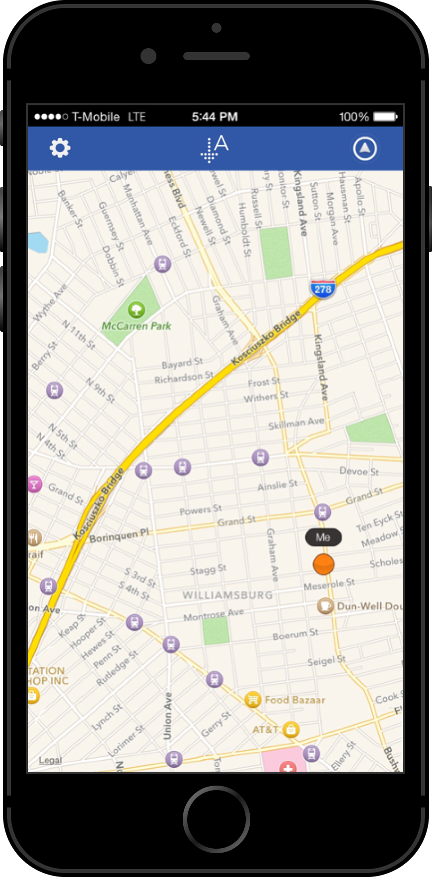
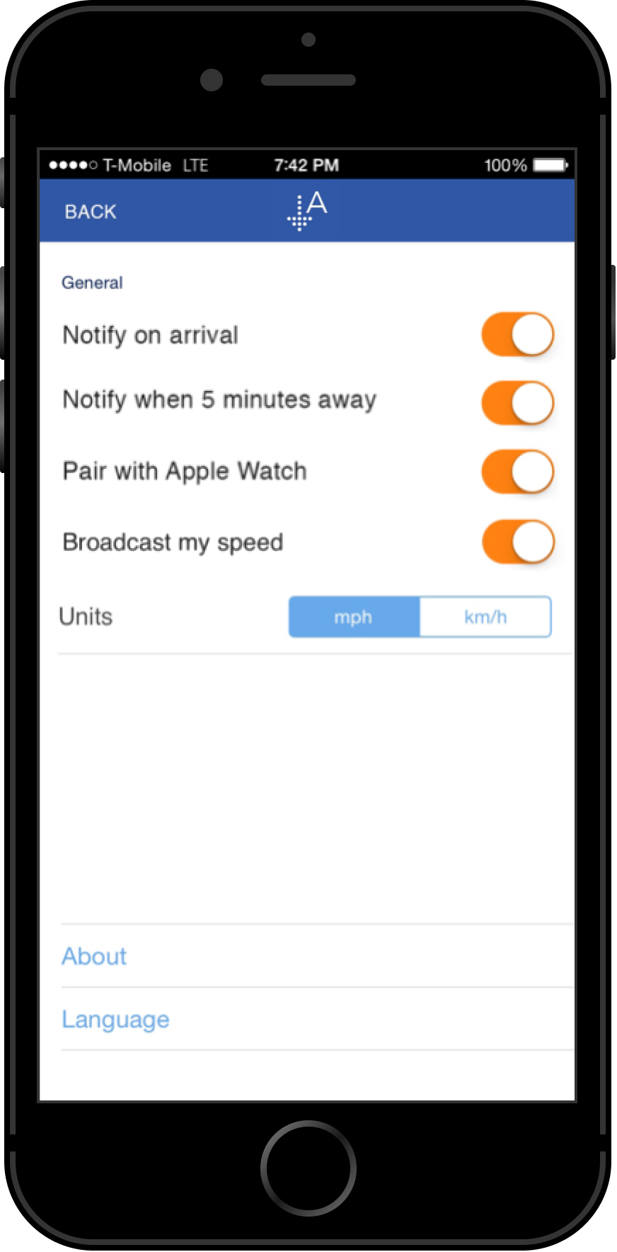
I had five participants test an early prototype of Arrival, built in InVision. Feedback revealed a need for quicker access to settings on the phone app, so we added a settings shortcut directly to Arrival's home screen.
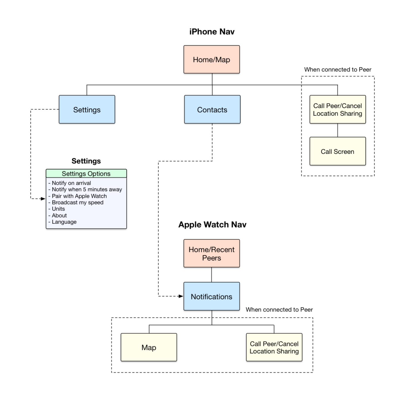
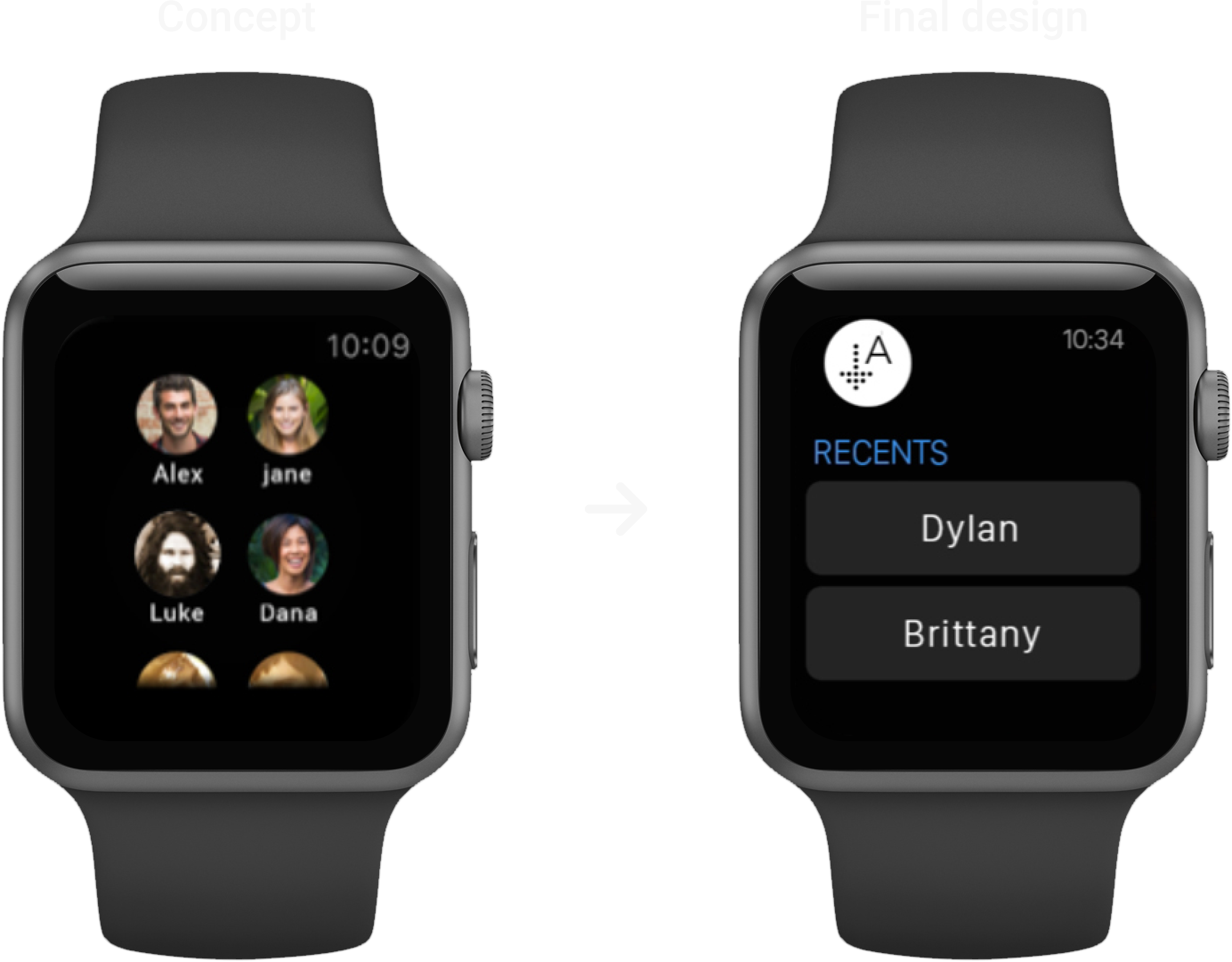
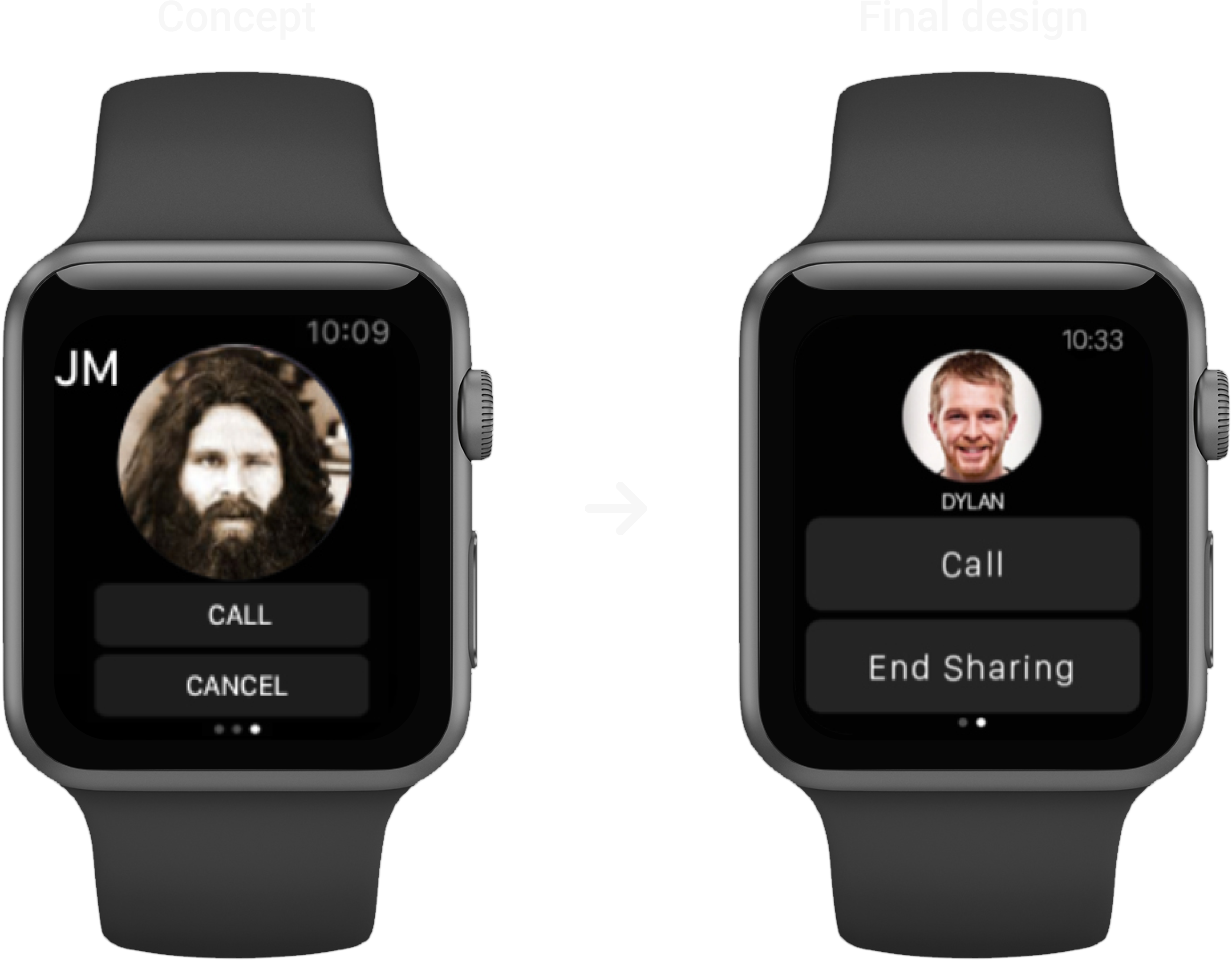
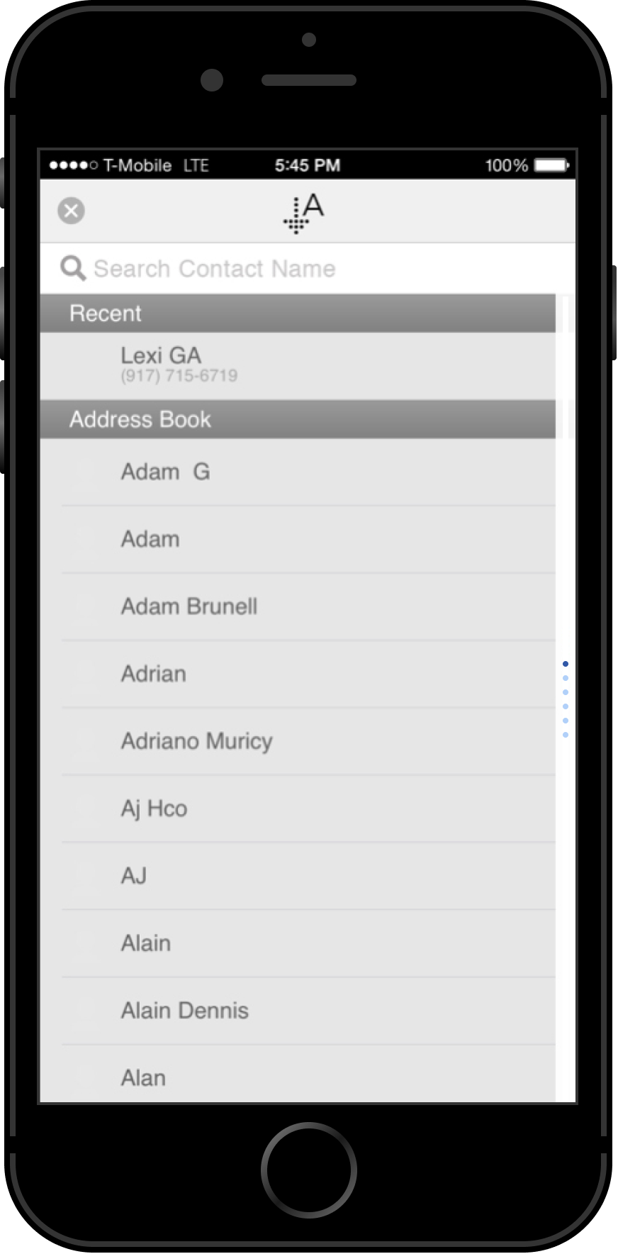
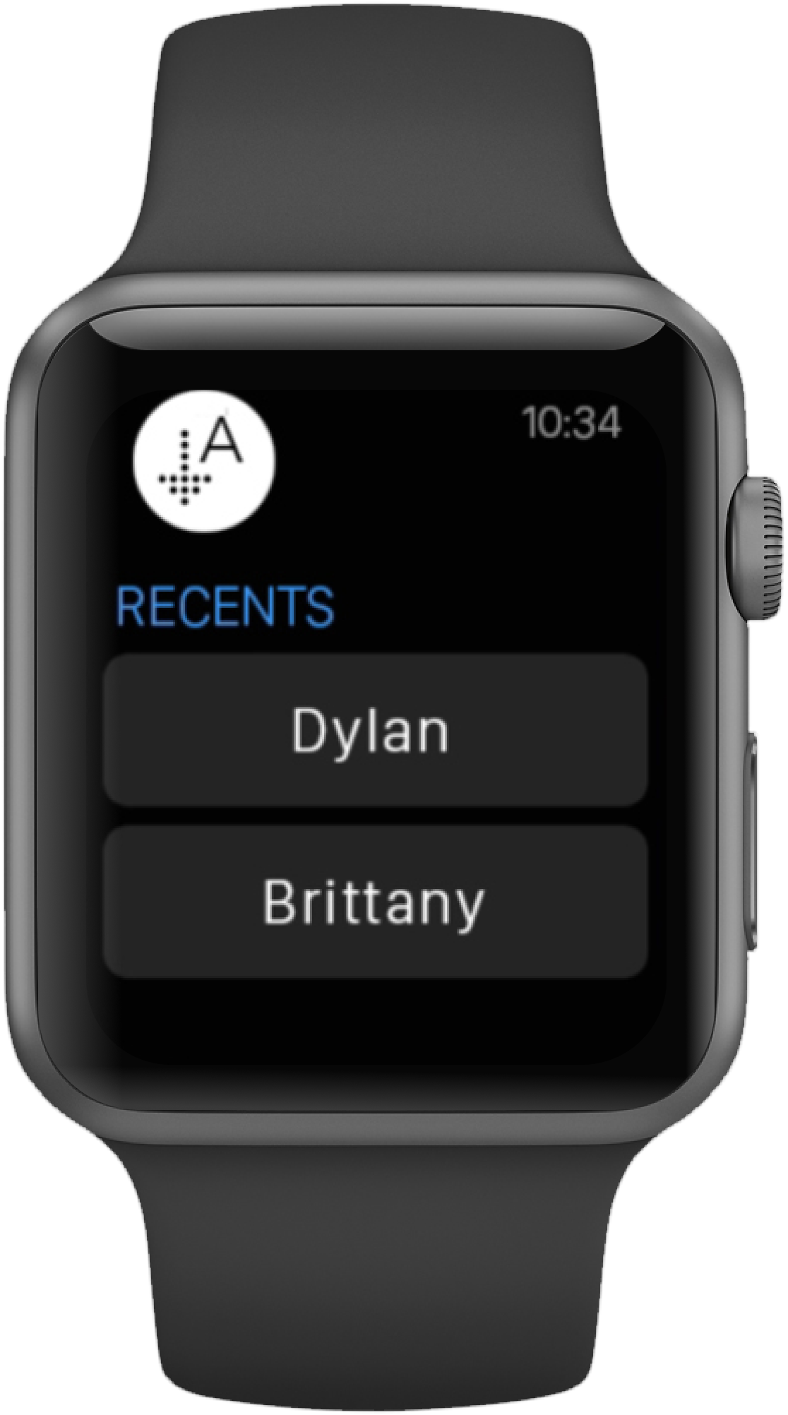
Users also noted that the contact list on Arrival’s Apple Watch app closely resembled the default Apple Watch contact list, which sometimes made it unclear which app they were using. To resolve this, we introduced a ‘Recents’ list that displays the user’s most recent Arrival contacts, providing a more distinctive and intuitive user experience.
Design Iterations (Phone)
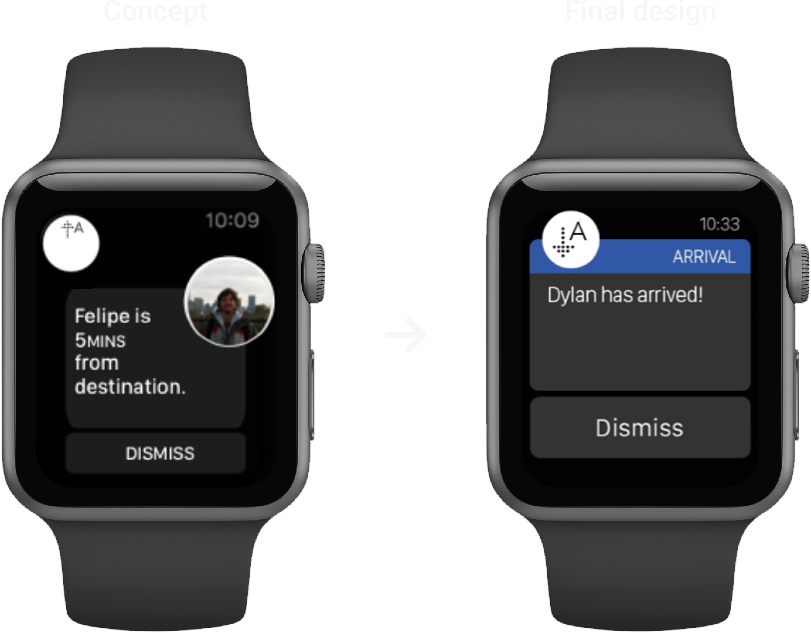
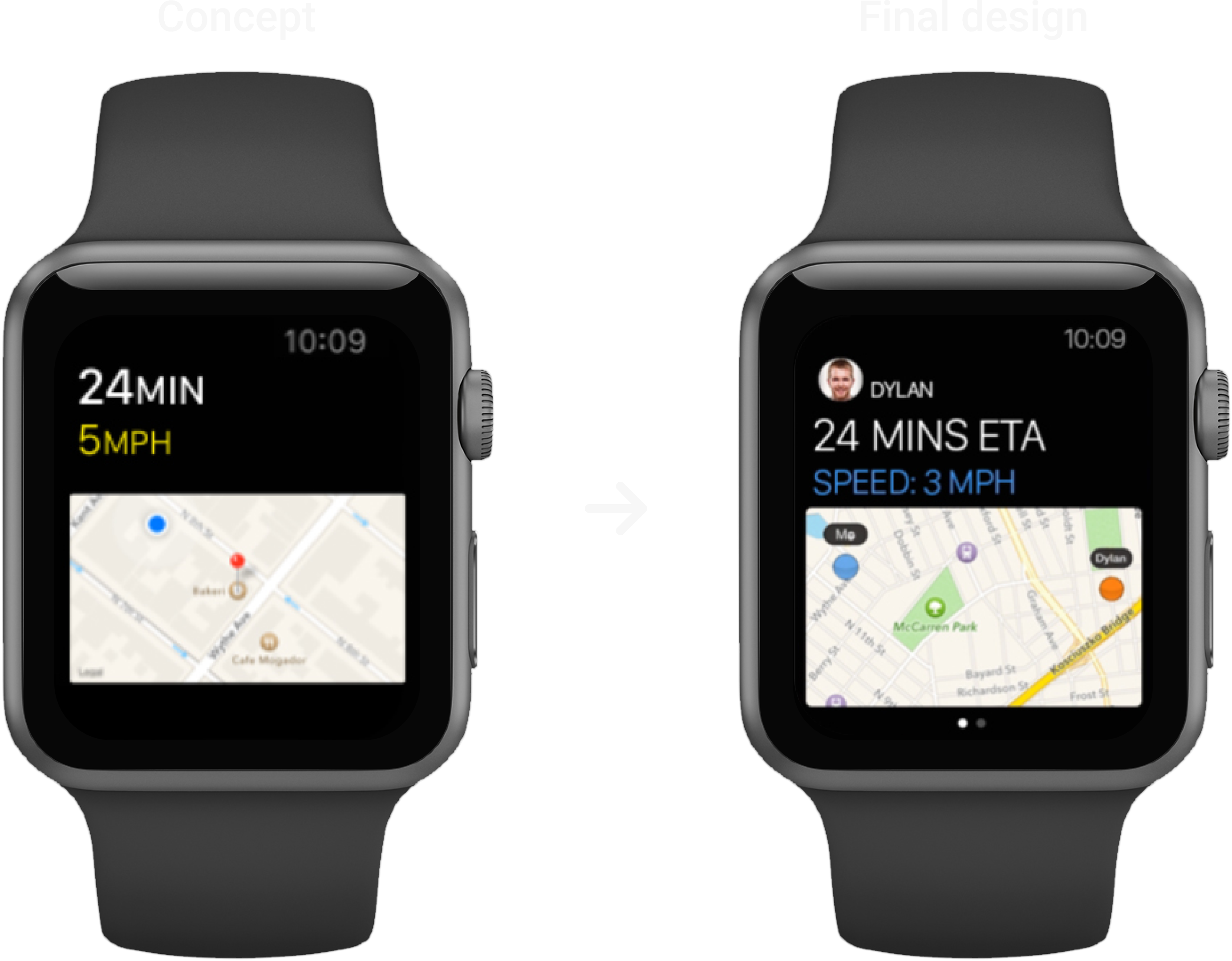
Design Iterations (Watch)
FINAL DESIGNS
END // END // END